Landscape Photography Today
– Denver Art Museum – June 24 -Sept 16, 2018 –
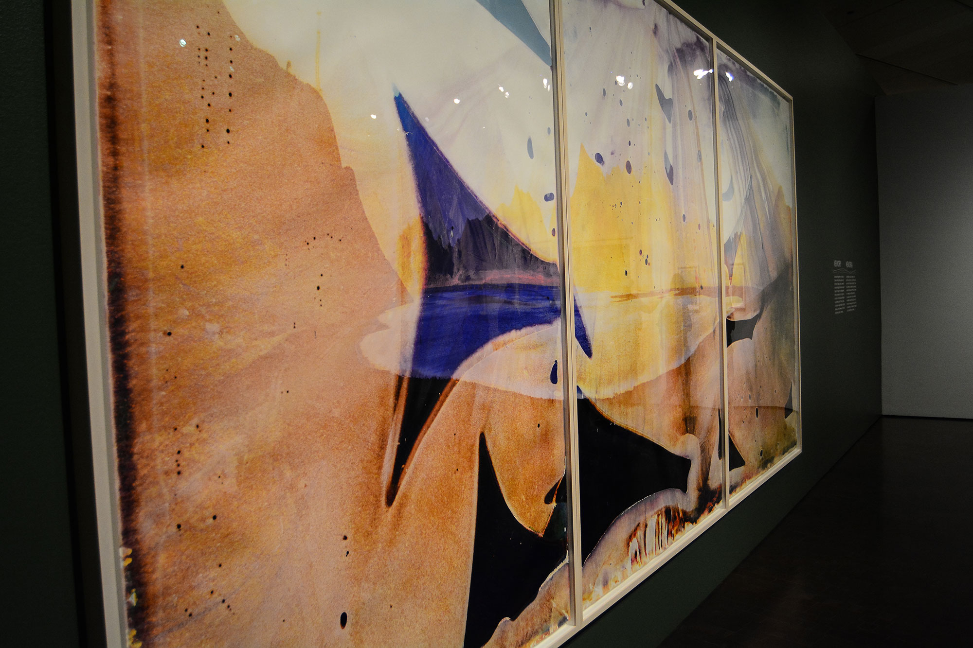
Some technically, difficult-to-make photographs hang on the tall museum walls along with some photos I know would be physically hard to take, along with some that are here by a whisper of good luck.
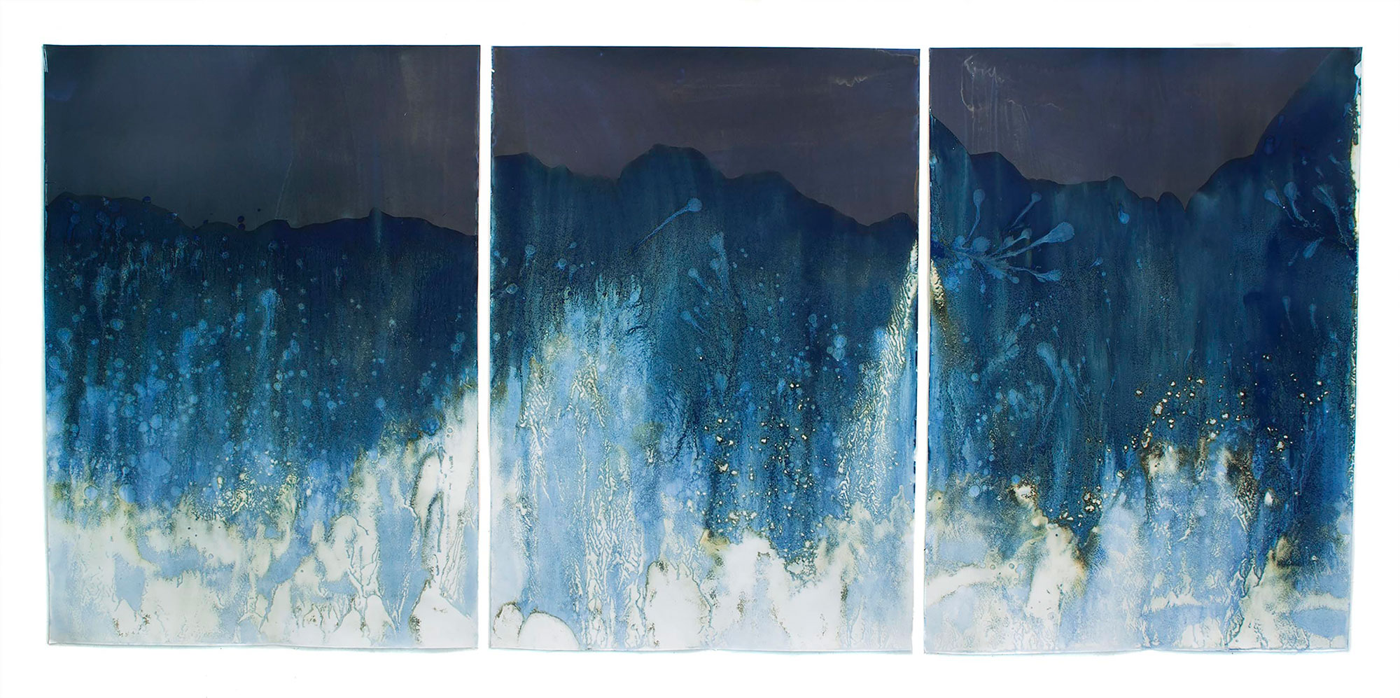
Matthew Brandt – Lake Isabella CA TC2, 2014

Physically More than their Thickness
The first image we encounter when entering the show is a powerful one. It’s one of those that is physically hard to get in position in front of, in order to press the shutter. The photographer, Clifford Ross, held the camera in the face of big waves, (Hurricane Scroll is the name on some later works by this artist, so I assume he was interacting with big waves) and got at least one image that is fantastic to see blown up to life size. To make it more present than a simply big, Ross printed it on maple plywood and the grainy texture glows through the wave’s image and warms it. Other photographers in this show set themselves up with physically difficult tasks: one walked from Alaska to Terra del Fuego – and others use techniques that turn photos into etchings, or use direct light exposure like the cyanotype but different from it, and several set themselves up with methods that mimic the accidents of old : when x-rays ruined film, or opening the camera back before rolling the film back into its canister would over expose some part of the roll, or reloading an already shot roll and double exposing it. The lucky, the hard and the technical: all make an appearance in this new territory. To help me decode some of the technical, I went on my third visit with a friend, Todd Powell, who has been making professional, pretty, landscape photographs for more than 30 years. He brought along a friend who teaches landscape architecture at CU-Boulder, Matt Davis. Together we talked about a classic, technically beautiful photograph taken from a perspective different from most landscape photographs — straight down — Pivot Irrigation #10, High Plains, Texas Panhandle, USA by Edward Burtynsky (2011) and you can see and hear the discussion.We also talked about Untitled (Brief Encounter) by Gregory Crewdson who seemed to have the very good luck to get the first photo after a snow. In his image, a car drives down a typical main street, its tire tracks making graceful arched lines exposing the pavement. The boat-like ’80s-model car rounds a corner into our view of the street its headlights leading us down the street. The lights of a tattoo parlor are bright red on one side of the road. On the other sits a woman alone in a diner and a man illuminated under the movie theater marquee that calls out the feature show Brief Encounter. I think I know this place and this time, but as we read the curator’s notes beside the piece we learn that Crewdson took this image in 2006. Reading on, we learn that he stages them completely with police, public works, actors and street lights under his direction. Before reading, all three of us had been fooled to think the photographer had just happened upon a beautiful scene. Would we have stayed fooled, or did the photographer leave clues in the image that he’d orchestrated it? Matt mentioned the car, pointing out that not many of this model where on the road in 2006. The bus, he said, looked even older. Todd noticed that all the street lights were on yellow — caution. A little too lucky – a slot machine on all cherries. We mulled over the title, Brief Encounter, finding it familiar, but none of us could think of a film by that name. A glance back at the marquee and we see a well-lit man walking below it. He would soon pass the lady in the diner. Her hair was something out of the past, or an Edward Hopper painting. We’ve read the curator’s remarks and know the actors in the scene were told where to stand while the photographer pressed the shutter, that the police have closed off the roads so non-actors won’t spoil the scene, but the weather must be waited for or seized. Todd has spent many mornings climbing a trail in the dark and sitting behind a tripod in the cold before the sunrise to get the right light. He said it wouldn’t have looked like this – what we’re seeing in the photograph — 10 minutes before or 10 minutes later. The light in this image is a mirror of the snow, a warm gray, and is the major actor in setting the mood. I think of twilight, the coming of night or as the French idiom goes: entre chien et loup — between dog and wolf.
Between all the beautiful, textural and compelling works in this show, I had twice before this visit missed an image by Andreas Gursky in one of the later rooms. It’s a big image and I’d quickly noticed it was pretty, but Todd clued in immediately that it was a reflection on water. I’ve seen several of Todd’s images of a mountain scene with its double in the lake lying at its feet. But the Gursky image has no context – we can see no river bank or lake edge, just the water and a beautiful turquoise reflection. Todd said it’s difficult to get the refection to expose just right. And anyone who has tried to blow up a photograph knows how quickly a bad exposure looks hackney. The difficulty, he said, is that you aren’t shooting the water where the images is, but the reflection that is on it. We marveled at the giant loveliness of Bangkok IV from across the room, and then walked closer. We could see the clear outline of a discarded pipe, a plastic bottle. Debris in the water hidden in the twinkling idyllic. Small photos with great concepts vie for your attention here, there’s a lot to see. One example is the Wonder Valley Survey by Mark Ruwedel. Made in 2013-14 of abandoned shelters that were never meant to be permanent, these images are displayed in a format you’ve most likely seen in a real estate storefront. The featured photograph for this post is the work of Edward Burtynsky and was taken by Steuart Bremner. Lorna Bremner took the one of Matthew Brandt’s, and the Denver Art Museum provided the one of Littoral Drift, by Meghann Riepenhoff.

