Wish You Were Here – Scott Young at Rule Gallery
September 23 – November 5, 2016

Denver – Rule Gallery has a new location at 530 Santa Fe Drive, in Denver, on the south end of the Santa Fe arts district. Excellent smells of asada from the street vendor on the corner hung with us as we stood outside the gallery looking at a neon sign. “Wish You Were Here” it said. And we were for the opening of Scott Young’s show.
I didn’t know Mr. Young before this night, and knew nothing about the work except I’d seen a great photo of the Wish Your Were Here sign, which I thought was just the title of the show. The glow inside the gallery didn’t clue me in and I walked around seeing neon as advertising forgetting that it might be the ‘art’.
 We obviously are living after Dan Flavin and others who have made art with neon, so I had no excuse to be so daft. And once my eye adjusted I could have started thinking about light and color and remembering installations that take up entire buildings like I’ve seen done by Flavin at the Menil in Houston or in Marfa at the Chinadi Foundation. But this neon was bent into neat square letters of text. I realized I’d been skimming.
With only a couple of words per piece, skimming is the wrong technique. Words made of gas flowing through tubes on the wall or on the floor exuding color at us, should alert me to slow down and give it a chance. ‘The line between the past and present,’ one said, in a way that finally was absorbed like heat waving over me like poetry. Form is important, we’ve been told since the Dadaists. They’d typed their work in a pattern on a piece of paper. They wanted readers to slow down to: read me/see me.

Their calligrams, as they’re called, are often reprinted, or translated, and dumped back on a page without the formatting. Poetry made in neon would require a lot of heat to straighten out.
So do you write poetry? I asked the artist.
Yes, he said.
Like what? (I expected it would be easy to get a writer to hand out some more language.)
I write mostly at night. In neon, he said.
Sparse, but pretty insightful.

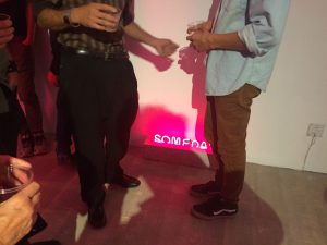
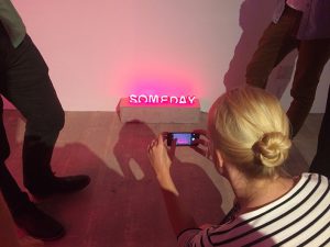
One piece interested me much more by it’s visual quality – it’s the word SOMEDAY and it looks like it’s sinking in concrete. It is small but feels weighty and was sitting on the floor. It was being somewhat ignored, glowing around people’s ankles. A carefully crafted word, neatly proportional, hanging with the potential of y.
The word sounds cheerful, but you feel bad for it when it’s appropriated for greeting cards.
Or, laid here in concrete on the floor. Very nicely so.

