Fall 2013-Winter 2014

SAN FRANCISCO – I don’t know if he should have gone so big, I said when I saw the first painting that was 32 average-sized canvases and covered an entire wall of the deYoung Museum, in San Francisco, where the show, “A Bigger Exhibition” is housed from October 24 through February 26, 2014.
This painting had been placed so that I had already seen parts of it filling doorways from other galleries. The dark mauve walls and dim lighting defined doorframes then faded into an ether to let the paintings levitate in space. There was a lot of process shown in these big galleries – Hockney’s ten-year experiment to develop a dictionary of new painting marks.
The really big paintings were prefaced by a more intimate gallery of watercolors – some portraits of his men friends and some landscapes. His shapes are covered with texture, the strokes are loosely laid down, rhythmical, and layered. These marks were painted, but could have been done – not quite as well – with a computer drawing program. This quality differentiates them from older work we’d just looked at out there in the permanent collection of the venerable California museum. These contemporary watercolors were built from a standard sheet of drawing paper 24” x 32”. As we stood and looked at the biggest one of this section, made of 12 sheet of paper, painters viewing with me said they struggled to be this loose – especially across multiple sheets of paper. Someone else said ‘they look so easy, but there are so many opportunities for failure.’ In fact, the first three paintings in the show had hardly worked and we had sort of tumbled in to the watercolors.
With watercolor, when you lay down paint, you no longer had white unless you break the watercolor rules and add opaque white. Hockney filled the paper from edge to edge with color leaving dramatic whites on one edge of nearly every shape giving California light to even the English landscapes. If you like beautiful painting, then most all of these really work, and looked, as our aquaintance said, looked easy.
From here, we fell into the central galleries with oil paintings where painting over mistakes might be technically easier, all the colors are opaque, but any mistake here, too, would have seemed an imposition of opaque white. You couldn’t correct the mark without having to recreated layers and layers of descriptive marks below. Marks that Hockney was exposing his viewers to, repeatedly, as he developed his lexicon of fern-scales, farmlands, trees.
The paintings in this section were all made on of an assembled grid of canvases that are easy to buy at the art supply store. After a while the frames around each disappear, but sometimes they make it easy to notice that the artist took the chance of putting one side of a tree on one column of canvases and the other side of it on another column. The center was bright, broken by the frames, but assembled in our mind easily. There is something easy and comfortable about Hockney.
But the big painting I first mentioned has leaves outlined in black, which seems to be a throwback to fauvist – 100 year old paintings – not digital-age influenced ones. This painting skipped the idea of light, of shapes rounded by white on one side/ dark on the other. I looked at this painting thinking he’d gone so large it no longer worked – the painting was wallpaper – and feeling the show was coming to an end. ‘There’s more,’ my friend said. And another floor.
I was in a vortex of this work – at the dull center – having come from a room of four seasons of video. Four wall were filled with screens arranged in the same grid pattern, playing the simple action of driving along the same Yorkshire lane. Snow dropped from the trees in one, light bounced through the canopy in others. They were silent but moving paintings. Hockney has said that paintings should give viewers pleasure, and he’s done the same with these videos.
From that vortex space with the too-big painting, I stumbled into to the next big gallery, a little suprised that my friend was right, that the works just kept coming. The paintings were not quite as big, and incredible. With a half dozen works Hockney had isolated enormous stands of trees into a form that confronted and pleasantly enveloped. And you could see the process. One painting had timidly circled the forest with white, while the most successful piece in the entire show – successful at sucking the viewer in – was a maroonish one that dramatically encircled the forest – red tinted trees drawn against a sky and lane. When Hockney is right on, he hits on something you think you’ve seen before, some dramatic sunset light that makes everything look its most gorgeous and you’re in the middle of it.
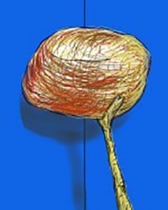
Then I went back to the too-big painting and started to look at the smaller pieces in this room. They were ink jet prints from a computer – 4 pages to a work. The paintings had been made on an iPad and blown up to a cumulative size of 6 x 8 feet. The marks made on the little screen had qualities of finger painting, brush strokes, and spray can painting – all things I know are tools available in my Sketch Up app. The layering of the strokes – his lexicon – were enhanced by the repetition aided by the computer. A little luminosity was lost in the ink compared to oil paint but the imagery was equally engaging. By the time most people see these paintings (over the Internet) that difference will be gone.
One last, very important gallery had even bigger versions of these iPad paintings. The image had been blown up further, and instead of four pages, there were 9 or maybe 12 printed pages. I kept wanting to get back further from them but the gallery walls stopped me. They were just blown up too big. The digital marks became to regular. A red squiggle too obvious – a yellow slash that wouldn’t have been a mistake at a smaller size was, at this scale, too much. The process – the decision making when laying down these loose marks was coming in and out of focus just witnessing this scale change. This wasn’t where the artist has pulled together everything he’d learned in the past 10 years of work, and a lot of work it appears to have been. He’d come to the focus point with the maroon painting and went out of focus just to make sure he’d hit it. Where to next?
There were several more interesting things to see in this exhibition – walls of sketchbooks, walls of videos that animated the process of the ‘sketch’ program, showing the application of marks, layer by layer. There were galleries of charcoal sketches of people and the same Yorkshire landscape, videos of jugglers. It’s a big exhibition. And, yes, I’ll come back to see where Hockney goes now.

