SITE Santa Fe, February 28 to May 19, 2025 — Fringe
Bathmats and quilts, and they aren’t pretty.
In summarizing the show, Fringe, at SITE Santa Fe, have I just made a political statement, that came into my thoughts from the abstract paintings by the artist Harmony Hammond? I’m saying the ordinary can be fringe, on the margins of society, and therefore lacking equality of opportunity; this lack of fairness doesn’t look good. Not that some of these works aren’t beautiful. Their beauty is no rainbow, but beauty from strength, some from obvious struggle on their surface and some from pulling themselves together to be as comforting as possible. That’s it, the explanation of my opening political statement because the personal is political. And all art is political.
I was curious what other people thought looking at this work, and three of us, women, went to look together and I took notes as we responded to each painting. Feel free to jump to the images and our collaged comments about the paintings.
The three of us had just come from a ‘book club’ where we discussed Hammond’s 1976 essay titled Feminist Abstract Art — A Political Viewpoint. The nearly-monthly book club is put on by SITE’s education department, specifically Kate Lee, and are linked to the current exhibitions. Lee had wondered, just like I had, if one would know the work in this show was political just by looking at it. In her essay, Hammond insists you can.
Hammond reminded me as I read the essay that many abstract artists of the time, those famous enough to be quoted in an art magazine, who were mostly male, played down the political impact of their work. I know Mark Rothko called his paintings meditations or like religious experiences. Lacking easily recognized objects, we tend to believe what the artist says. Jasper Johns denied his “flag” paintings had any political meaning. One artist in our discussion group, said her work is abstract, about external and internal energy in tension, she said. Purposely not political.
Another said an artist can also not be aware of what their work says to others, that Hammond has said she didn’t see the pain in her work until someone else pointed it out.
In the essay, Hammond was criticizing an earlier, 1975, essay written by a pair of feminists who thought art could be a powerful tool for bringing about the revolutionary future they hoped to see, but only if the work had the proper content, which they meant was to be explicitly feminist, literal and representational.
Two of Hammond’s works in this show are not purely abstract but begin with a recognizable image, most obviously the one with a tattered flag. We get it, flags get ragged like our democracy, and somehow that easy reading explains to me why Hammond doesn’t want to make ‘explicitly feminist’ work with surface meaning. Abstract work asks a viewer to look a little longer and think a little deeper.
In our reading of Hammond’s essay cheering on abstraction we are reminded that traditional woman’s crafts: quilts, rugs, pottery are generally non-representational, abstract, often geometric. And that sometimes quilts were made by politically-minded woman that included hidden meanings. She sites a particular pattern that was used by the Whig party in England to show solidarity with their anti-slavery movement. Somehow a viewer would have to be told about this. We wondered if we could feel, understand the feminist politics in Hammond’s work, without reading.
In answer, the group offered statements like: she paints a grid then interrupt it; the canvas are uneven, roughed up, manipulated, ripped, and make a statement like ‘fuck the canvas,’ while still falling within the genre of painting; doubling is feminist. Sounds a little political.
When asked about people she’s taken on tour of the show, Kate Lee said one man said he felt locked out, that these paintings were not of his culture. (He felt a little feminist protest?)
A man in our discussion group said he hadn’t read anything about the work before seeing the show, but had been drawn to the cross imagery. He felt them viscerally, he said, and had a instinctive emotional response. Then he wondered, if in all the male-made abstract art he’s seen, was he supposed to feel emotion. Or is it suppressed? He said he was going to look at this kind of work differently next time. Another person in the group wondered if in her own writing, which is about education, she had suppressed her own feminism. Do we read texts and know they are written by women, I wondered. Do they have to be political or is it okay to just be informative? And is that political?
I had not read the text of the brochure (or website) before seeing the show – I usually get angry at unfounded assertions about the works ability to say something. Or the curators assertion that it does, when it’s not overt. So I go to the brochure, and it starts: Harmony Hammond’s work rejects figuration yet evokes the body at every turn — implying a topography of its clefts and folds barely contained by the skin of the paint. I strikeout to read this beautiful sentence more obviously. I can see why the curator started with it.
The paint does contain the undulations, in a skin-like way. Yet the canvases are very geometric and formal. Often double shapes, relational like bodies. Okay, maybe I buy this, and then I remember the colors. The whites of the monotone-ish white canvases could best be described as close variations of the ‘flesh’ color in old crayon boxes. Without reading, I had thought of bodies. Nice job curator.
But, must I think of the black cross on white background as a statement about ‘intersectionality’, as the brochure asserted. (I needed to be clear on its meaning because I just thought it was groups in contact with one another in society, but it has become what happens with the contact, for example, that women walk a step behind men, some races, groups make less money). The cross is a sign for adding on – the plus sign – the brochure reminds me. The two colors are pretty distinct in this painting. It elevates the black. I’m not sure it is a good illustration of this trendy word ‘intersectionality’. But, again, thank you curator, I learned a new word. More obviously, these are about relationships.
This is more obvious in the newer paintings, many being strongly ochre. Double painting: ochre and red, isn’t that implying a topography of life on earth? In relation? And let me just say there is a lot going on beneath the surface, but the two colors are in balance. (Nice political statement, Hammond).
Several folks at the end of this discussion said how pleasantly surprised they were that the ‘book club’ was far better than usual book clubs. We’d all actually done the reading, said one guy. Thinking about art in community is useful. Wrestling with the official brochure is fun, too.
Images: Direct Reaction
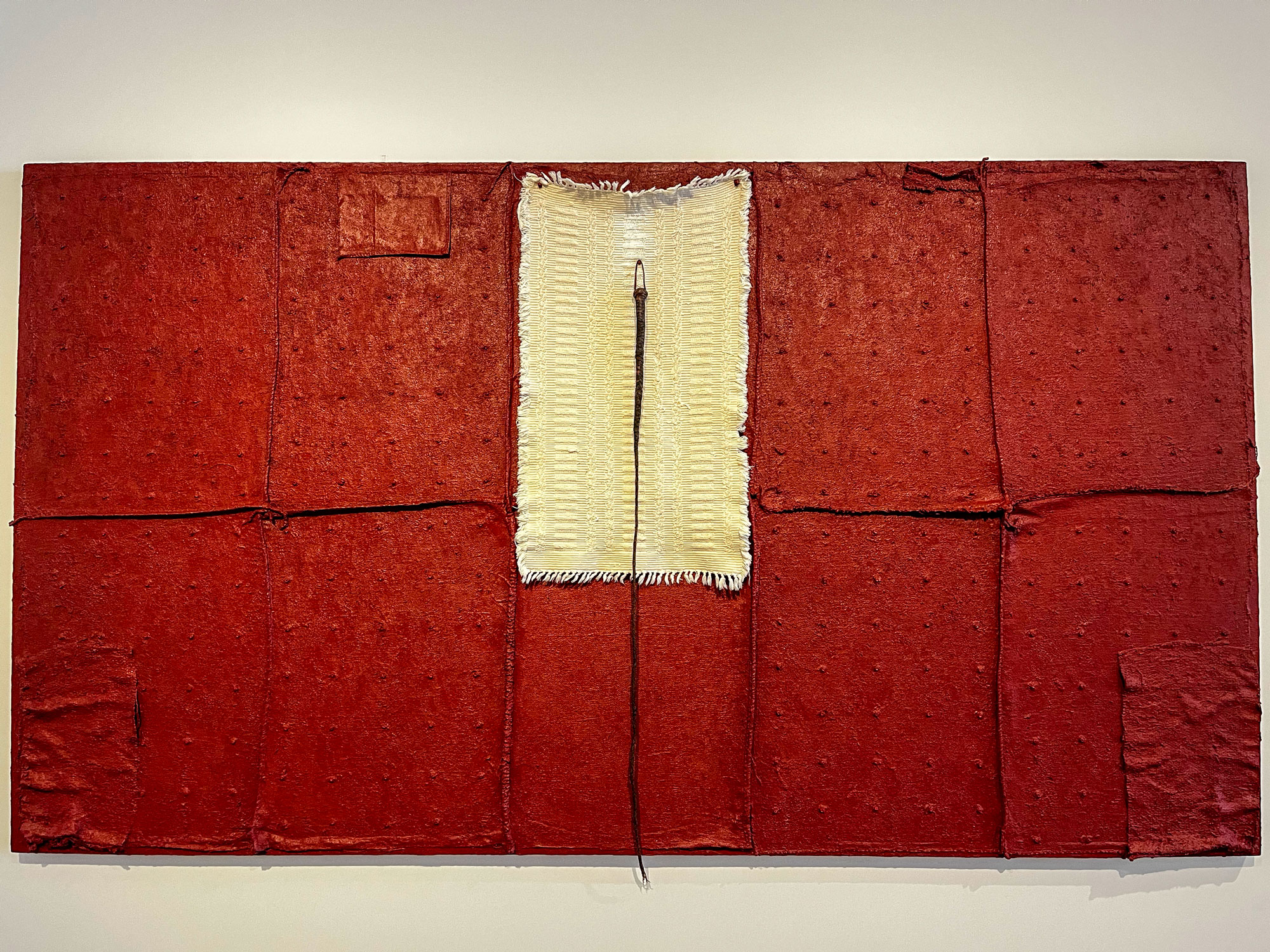
Double Cross IV, 2022-3: Something my grandmother, or my mother, would have owned, this obvious and pure-white bathmat on menstrual-blood-red background, stitched together, the bath mat connects two cross patterns (like a traditional quilt pattern) on its left and right, and is exclamation pointed by a horse whip. Color reminded us we called our periods ‘the curse’ and thought we would die, but more likely would soil some white linen. We recognize fabric and that feels familiar, of our family, the regular pattern of the grommets applied to the canvas physically reinforce the image as quilt-like, of traditional female crafts. Additional layers of fabric are applied to the bottom corners of the canvas. It comes weighted. And with double meaning of double cross – the two monochrome crosses made of fabric and the idea of being betrayed – double crossed. — compiled from conversation with two other women in the presence of the painting.
~!~!~!~!~!~!~!~
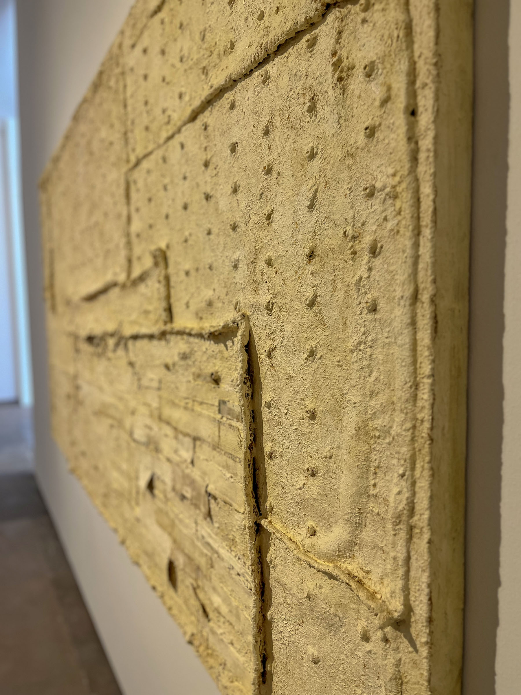
Chenille #5: 2016-17. A bedspread memory is invoked by the title – chenille is the fabric with bumps (in various patterns: stripes, roses) that were very common especially in the 1960s. Coming from the previous piece, Chenille feels quilt-like but different, the big patches feel tense; the grid-like pattern of grommets, chenille-like bumps, have a red center that could be rust or red paint, which feels like it could bleed, but are being corralled by white paint, repeat in a way that seems structural like the rivets on a ship. Paint covers these fasteners, this ‘covering up’ is in tension with what is visible: covered whip cords, grommets seams under visible whiteness, frayed edges, brush strokes.
!~!~!~!~!~!~!
Double Bandaged Quilt #32020. Log Cabin pattern of quilt making painted white — monochrome makes texture the big news: ragged edges, ripped strips of cloth, become a continuous (comforting) whole when pieced together.
~!~!~!~!~!~
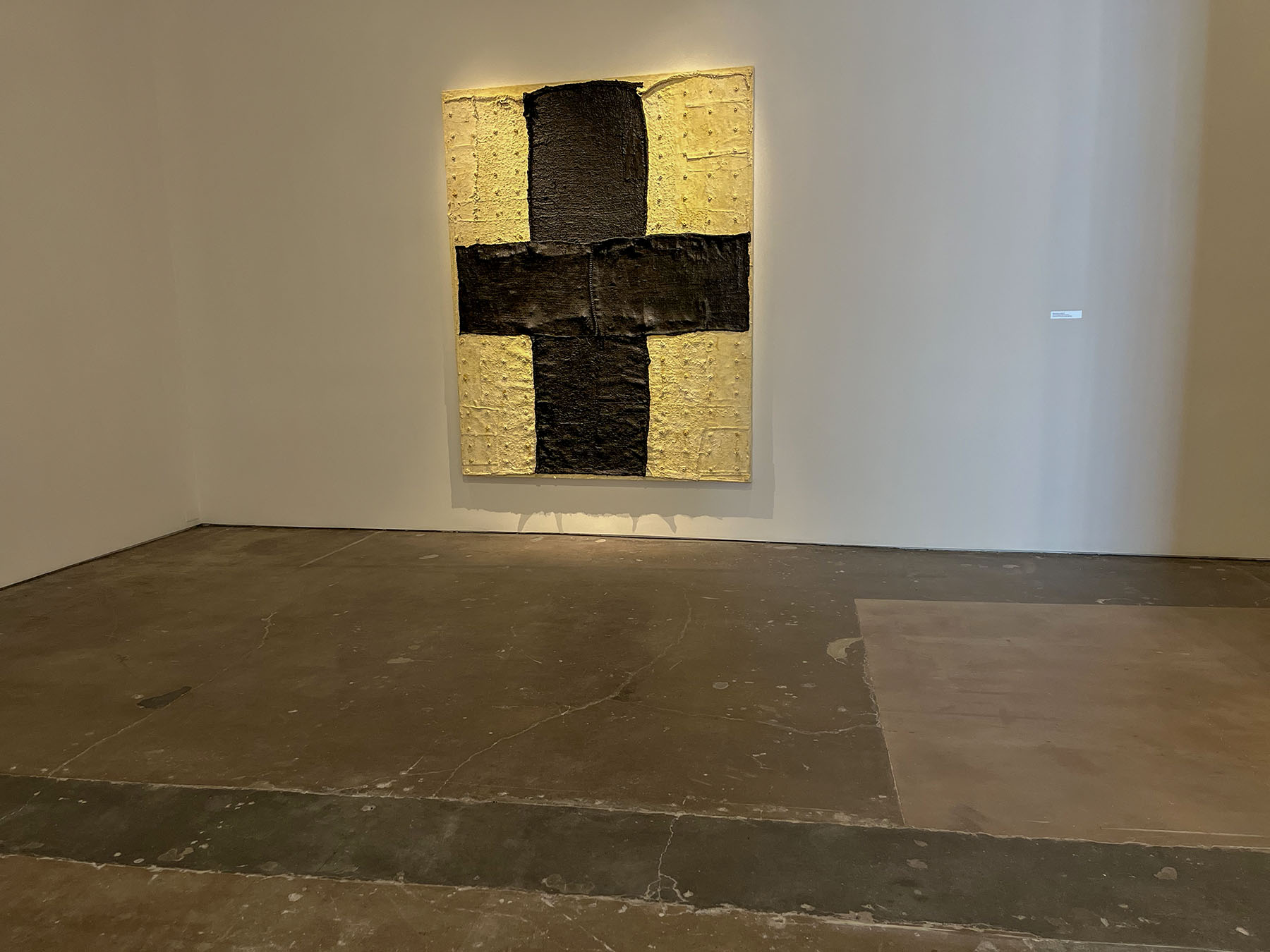
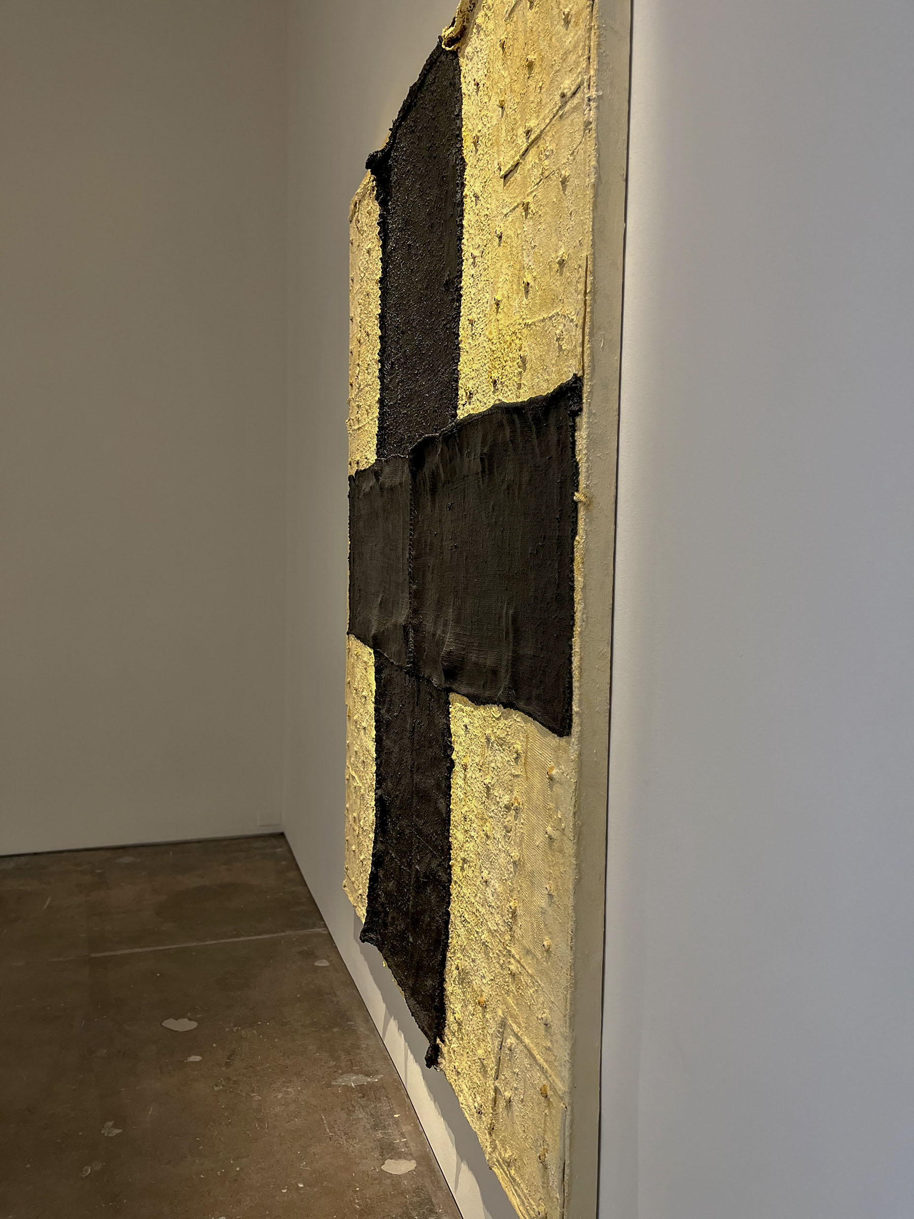
Black Cross II: 2020-1. The black cross is obvious, centered, not quite a Christian cross, not red like the Red Cross, not multiple shades of white like the previous pieces but attempting intersectionality, or bringing in culture and ethnicity. The seams are obvious as is the pattern in the white zones. The black is matted over things that are poking up, in much less regular patterns.
!~!~!~!~!~!~!

Patched: 2022. Less abstract than previous work. Easy to see that it is a quilt that’s not in new conditions, similar to the following piece, made of a tattered flag. The pattern of this quilt is know as a cross pattern. The larger white square are decorated with rags used to clean paint brushes. All were brushes that had red paint and so the residue is an oily red stain.
!~!~!~!~!~!~!

After our long discussion about abstract art’s potential to be political, we allowed ourselves to skip this painting and stay focused on observing non-literal messages coming from the canvases.
!~!~!~!~!~!~!
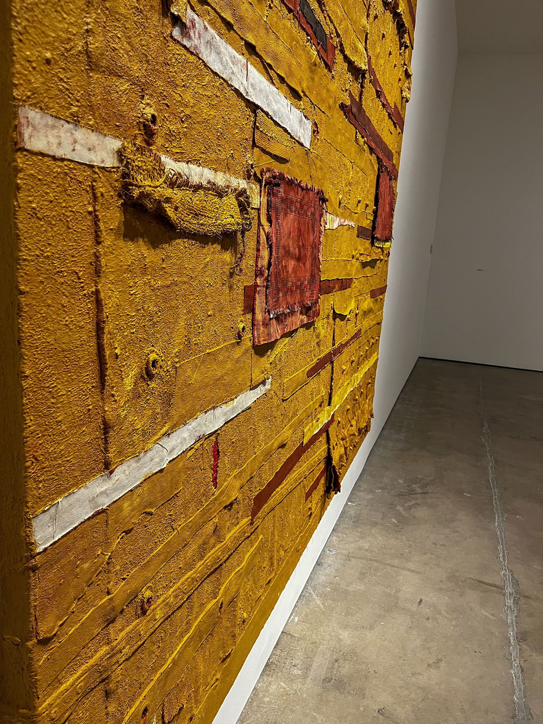
Bandaged Grid: 2022-3. Vaginal openings interrupt the grid, as if a wound in the quilt. There not numberous, but repeated, and each is small, human scale, with bright red interiors. Early ochre is the primary color, women taking on the land, but recognizable placemats, spattered with paint make us uncomfortable, they would not be laid on a table in this way, their background placemats are different sizes and are certainly not centered. The bandages are applied with the painted exterior showing, and also the ‘wrong’ side, which reminds us of sewing. Put right sides together, sew the seam and turn inside out for a clean flat seam. Lower on the painting, like a ruffle on a skirt, the fabric is puckered. Feminized.
— compiled from conversation with two other women in the presence of the paintings.