Recently in Contemporary Art Museums Category

Tony Cragg - Nasher Sculpture Center

| No TrackBacks
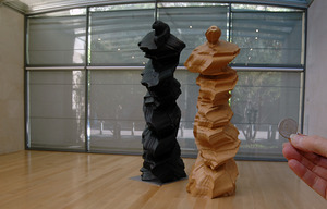
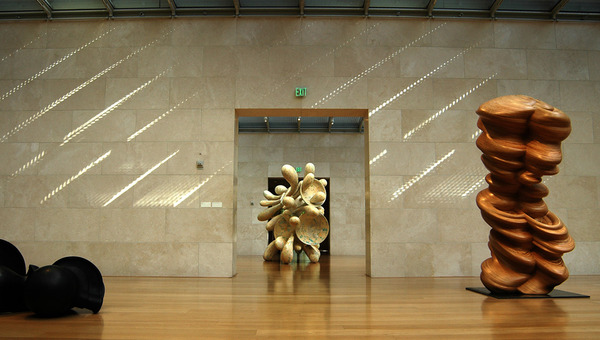
CraggFiberglass.jpgThe clean sparse naturally lit sculpture center in Dallas, created by the 20th C. collector moguls Raymond and Patsy Nasher, shows Tony Cragg's 21st C. sculpture like they were made for each other.

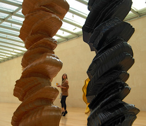
CraggQuarter.jpgCraggHeels.jpgCraggLower.jpgCragg's work is slick and purposeful, but so detailed it could only have been made by Computer-Aided somethings: like software and router, cutters and pointing-up devices. They are assembled by some kind of careful, aesthetically superior being(s).

Forms blow up the complexity in small detail over big surfaces. They demand attention. We think we see Washington's face on the black one, and so hold up a quarter to see. The familiar face from our money looks like its been twisted and morphed into abstractions of itself.

The spaces between these complex forms frames the woman in the ridiculous heels. All three stretching themselves taller. The piece in the entry way, the top photograph, has small intricate openings that let a viewer peak to the outside, and through a window in the fence, to the street. The complexity of the layers of our vision cannot be ignored when we're in the presence of this elaborate set of forms. We don't have to pay our phone bill with them, so they are instructive friends rather than our ultra-logical opponents. 

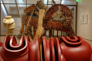
On the lower floor are two sculptures where narrative objects get piled together in what could be a messy heap, but instead become uniform and painfully-complex and beautiful sculptural forms. Physical sculpture is about full real, tactile, non-virtual shape and when most of what we experience is now virtual, the sense of real shape can be forgotten. The plunger colored sculpture in the foreground of this picture calls out to be touched. Nice shape. Beyond it is one of the two narratives that you just have to get up close and discover. Covering this boat like thing are hundreds of screw-in hooks, many repetitions of nearly the same object - and object that sames come on and back off at the same time.

Beyond that piece is a white form with black dots. Up close, the surface is covered with dice. To cover the form with these regular cubes the area where the smooth surface must break because of the cubes has the interest of a flowing arroyo. The number of dots on a die mean nothing. Likewise his drawings are made with a line |  or a circle o.   Ones or zeros, but they are not like programmings ones and zeros, there are infinite varieties of a hand-made 1 and hand-drawn 0. Push, pull.

I hear 3-D is the new New.
 

Fred Sandback until Sunday

| No TrackBacks
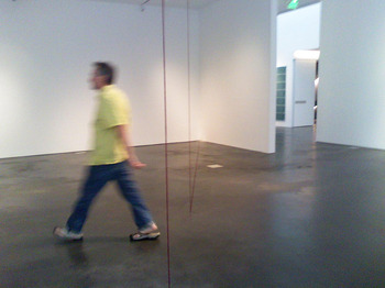
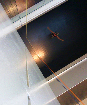
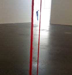
FredSandback.jpgFred Sandback's work is at the Museum of Contemporary Art until the 23rd  of October. Until then the museum is filled with lines drawn in yarn -- big lines, very precisely drawn in acrylic yarn.

A line pulls you into the main floor gallery and points to a square drawn in yard that is attached in two points to the wall and two points to the floor. FredSandback2Levels.jpgThe lines are different colors, but all the same in that they are made of yarn. If it is two, three or four strands of yarn you hardly notice until you're seen several rooms of these shapes drawn in yarn. By that time you're noticing everything.

You notice as you walk down the hallway that the EXIT sign is not exactly hanging level. Some of the electrical plates on the floor, beautifully machined as they are, are not quite installed impeccably. The floor shows sign of uneven color that isn't entirely interesting. 

FredSandbackRed.jpgI came to see this show, after tromping through the Fall Home and Garden Show at the Convention Center. There I had gotten into a long discussion with the saleswoman from Kwal Paints who had a very nice booth that included a simulated room - a corner essentially that was painted more elaborately than most people paint their rooms but that showed off the bright bold colors the company offers. It was a very hard-edge, geometric design, and the woman asked me if I liked it. Yes I did, but I think the painter should have been more precise in one spot and should have chosen a different style of molding to join the corner. The woman was appalled that I'd be so critical.

Then I went to see Fred Sandback. His work is about precision. It is nothing like the Home and Garden Show.

Another Victory: Gato Encerrado

| No TrackBacks
Museum of Contemporary Art Denver: Another Victory Over the Sun
June 9, 2011 - August 21, 2011

black.pngVictory over the Sun is the title of a 1913 Russian opera. Another Victory over the Sun is the name of the summer exhibition at the Museum of Contemporary Art in Denver.

One work, the short video by Miguel Calderon, called Los Pasos del Enemigo, The Steps of the Enemy, I've seen several times. It was scary, wariness evoking every time, except one.

First, you have be aware there's no sunlight coming into the museum, so you can't really find the entrance to the video room. You can hear sounds of a wild cat before you find the entrance through the heavy black curtain into this gallery.

I fumbled around in the pretty-near-blackness and stand in pitch darkness. I don't know what's in this space with me.   There's a burst of guttural roars - a big cat of some kind - and then you're surprised by the flash of yellow eyes and menacing teeth, and a sporadic variety of more growls.

On the day before the show opened, I heard that sound of tape ripping off a roll. They were finishing the work of blocking out all the sunlight. You've seen movies of people being duck taped. It's a scary sound in a dark room with a panther growling at you. The steps of the enemy ... when it's dark you can see those steps.

The next visit I was by myself, and realized I have very poor depth perception in the hearing sense. I knew what was going to happen but still I felt not so confident. The piece is very effective at letting us know our place is nature is very complicated.

Another time, I read the curatorial card that explains the piece and it refers to a Spanish expression:  'gato encerrado,' which literally means 'locked up cat'. I learn it is also the Spanish equivalent of: 'something's fishy' or 'I smell a rat.'  And I start to think of how the video was made - probably at a zoo - with a locked up cat. I'm being scared, effectively, by a big cat in a cage. And my enemies, I'm not sure where they are. I am in the dark about them.

The only time I was not creeped out, scared, and off balance, I went into this gallery with a bunch of people, who all happened to be my family. We can bump into each other and its funny not scary. One laughs and someone makes a joke that we've probably heard before.

It made me realize why all those Ancestral Puebloans who used to live at Mesa Verde vanished - completely vanished from the Mesa - about the same time. They wanted to stick together.

If you'd like to read or hear more about this exhibition on UnsafeArt.com, please click on Personal Victory.

Personal Victory

| No TrackBacks
Museum of Contemporary Art Denver: Another Victory Over the Sun
June 9, 2011 - August 21, 2011


VictoryBanner.pngLearning to step into the shade was my first victory over the sun. Is this show about how man's ingenuity can beat nature's unpleasantness? Or do we need to know the art history themes attributed to the first Victory Over the Sun to get this show?

Victory Over the Sun is the title of a 1913 opera produced by Russians called Youth Group. They included adults as old as 50 so this was no camp project but an assertion of their own importance from a new group of 'emerging' artists - poets who wrote the libretto in Zaum, a language developed from the emotional and instinctual quality of sounds - and artists, including Kazimir Malevich, who is often credited with making the first abstract painting.  A reproduction of this Victory, made by the California Institute of the Arts, plays in the elevator, if you wish to watch it. The opera, Internet research points out to me, claimed to vanquish the 'sun,' a symbol for the previous generation of artists, called the Symbolists, rational, intellectual, nature lovers. The new school victors' were right to gloat because their thinking did predominate art for the next twenty years, evolving into, generally, surrealism. These artists made paintings and poetry with whatever came out of their heads. Natural man triumphs over the sun and rationality.

The show directs us to this opera as a source, and then does some of its own battling with the sun. For Another Victory Over the Sun museum staffers blocked out all natural light. This building is no windowless schoolhouse, but a green building that uses natural light for most of its daytime illumination and the effect is noticeable. The entry is lit by a Dan Flavin piece called Monument to V. Tatlin. Tatlin was another Russian artist from the early 20th century. Anyone standing near the piece glows fluorescent.

The other works in the show produce their own light, too, and it helps to illustrate the exhibition notes that claim art can create a reality more intense than its architecture. Art is like a campfire, we're told, it is more than its logs and twigs.

Man over Nature, New over Old, Emotion/Instinct/Feeling over Rational Intellect, Art over Tangibles.: that's our list of given possible themes.

MoonSea.jpgMany of the pieces in this show offer experiences that are more than the sum of its parts, and yes, they are emotive, and about nature, and all done in this millennium. We can feel the snarls of a panther in the dark, glow with the moon over water, play with mirrors in an overgrown castle, speed up the transit of the sun, imagine infinity, contemplate the twitter of birds, and graph the sway of trees.

Yes, I learned about emotional vs. rational art appreciation. Yesterday, I visited the museum with a friend who believes the sensory/instinctual human has power over the rational. She believes that a guru gazing on her will heal her body. (She's also using everything Western Medicine has to offer for her cancer.)

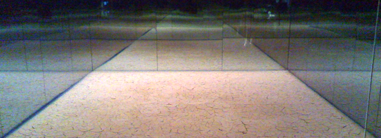
We walked into the gallery with the piece called Between the Moon and Sea. It is a wooden boardwalk built over a room-encompassing, black plastic pool of water illuminated by a beach-ball-size, cloth-covered lamp. "This must be a come-down for someone who has lived in the mountains for so long," I said to my friend, thinking of my experience of back-county moonlight ski trips as a much bigger, heart-thumbing, cold--and-hot-at-the-same-time kind of experience.  She completely disagreed. She loves the piece. It makes her think of everything she loves about nature -- and more, and more.  I slow down and stop trying to rationalize if this piece works, and take a photo of the EXIT sign reflected in the water. You may listen to us talk about the entire Another Victory over the Sun exhibition, if you'd like.

She and I are predisposed to give art the benefit of the doubt. Many of my environmentalist friends are not. They see art as just another commercialism of man's intention to triumph over nature. And they want nature to win. They are certain than nature will not go down easily, and if it does, it will take us humans with it.

Contemporary art's urban emphasis is somewhat the cause of my enviro friends' distaste. Land art was only big when it was about machines tearing up nature and making things like the Spiral Jetty. Present-day land artists like Andy Goldsworthy, seem somewhat parochial, while graffiti gets attention. Publicized contemporary art is often messy and about shit and self-inflicted violence or rooms that remind me of bad roommates. Rarely does it talk about the concerns of the environmentalist.  But this Victory does. Although I'm not sure the environmentalist or the curators know it.

The experiences in this MCA exhibition are as powerful as my friend said, unless I analyze them to death. When I experience Los Pasos del Enemigo, The Steps of the Enemy,  panthers are, I am reminded, amazing. They make sounds and behave in ways that people living in a city forget. I don't want them to disappear even if they are scary. Everyone wants the opportunity to contemplate the moon in a quiet, under-developed place. We like the quiet and peace of undisturbed land, even if the birds are so loud. We like the sun, actually.

VictoryShirreff.jpgIn the upstairs galleries are three different artist installations that show at least four more instances of the wonder of everyday nature. Outside the gallery showing trees in a breeze and bird's on a branch, the curatorial notes tell us David Zimmer's work shows the 'enigmatic in the everyday.' That's a nice phrase for the puzzles that nature provides all the time. And art can make vivid.

Another makes me think about how the sun's daily journey changes how I see object on the planet and on my desk. The third gives me a mirror view tour of a Mexican villa over grown by nature.

Most of the work in this show does create new realities. For me, the reality I came away with is that contemporary art doesn't need to be messy, necessarily urban, self-expressive, but should be clear. Sometime the clarity can only but felt. Sometimes the enigmas are not understandable. Not at the moment; but art gives me the hope that they can be.
TateSimonPan.jpgJuly 8, 2011
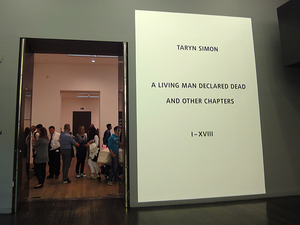
Tate Modern: Taryn Simon A Living Man Declared Dead and Other Chapters


London2011.jpgMy goal is to pass beyond the guy at the podium and start my trip to England and beyond. 'What's the purpose of your trip?' the guy asks holding my passport. To see art, of course. Instead, I say 'visit family.' I want to slip in, look ordinary like my passport photo on its neutral background.

Inside Britain, inside the Tate Modern, there's a big show of Joan Miro work, but today I look at a living artist, Taryn Simon. In A Living Man Declared Dead and Other Chapters, she shows a series of photo and text assemblages - each with about three parts. One is a grid of passport-like photos, next is text, and third, what the artist calls footnotes.

When the photo is stark enough, like these or a passport, The Identity could be anyone's. One of Simon's subjects is the double for Saddam Hussein's son. Another is a rabbit.

I had to testify, once, before a grand jury. I was handed a page of color photos with the open-ended question: could I identify anyone on this page?  My husband's picture was there and I didn't recognize him until the district attorney pointed him out. The photo was such a bad likeness, and I was surprised to see him on this sheet. He'd sold a truck to a friend, one of the suspected pot growers. I guessed another photo might be a female friend. She was so plain and typical looking in this photo that I wasn't sure. 'Poor pothead, doesn't even know her own people,' I am sure the grand jury was thinking. I was thinking how hard a person is to identify with one photograph.

To truly identify an individual ask to see a facebook page, a library record, my home, or my journal. But, that is not the purpose of passport control. Their job is security; so scan my body for weapons, make sure I am committed to working for a more just and liberal - sorry, liberated - society, and plan to harm no one. What is the artist's job?

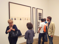
Simon_Exhibition.pngSimon's show - in three big galleries - consists of many large, nicely framed grids of photos - images of small heads on a 'non-place' background. They are similar in style, but different from a passport photo in that they are full of one of the necessary ingredients of abstract art: namelessness. Abstract art removed the human so that the image could be universal. The humanlessness of passport photos is why governments want retinal scans and DNA. The artist either doesn't know how humanless these photos are, or we're to feel like they are the universal human.

I read the wall's worth of information about how the grid is like a family tree showing relationships - descendants below antecedents - and then read the details at each piece about some weird political situation that involves these identities - like Saddam's son's double. Or, people whose relatives have declared them dead so they can steal their land.

Conceptually, the project is interesting.  However, the artist has not made the best choices for conveying the information to her audience. Sure anything goes in postmodern art. But, we're at the Tate Modern here, and there needs to be some discrimination. Why?  Because a lot of people will see the work, so it should be effective for the audience - the viewers that will see it.  Otherwise, it's just granddad boring us with pictures he took of his hotel rooms on his bus tour of Germany.

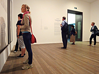
Simon-Audience.pngLook at the people in this exhibition. They're myopically reading the walls. Or standing in the center talking. One of our group suggests that Simon make it easier to read the narrative, and give us the time and space to read it - publish a book.  Good idea, but her current audience is, right now, wandering through the Tate Modern. And, it's a big crowd, a less-than-mainstream crowd: people willing and able to look at contemporary visual art.  Give us the visuals.

Could the relationships have been identified graphically? Tiny text at the side giving the name wasn't helpful enough. The 'footnotes' sections are not in giant frames. They're small, filled with documents, some interesting character snapshots, and the meat. Isn't it annoying to read footnotes that are more interesting than the main body of the work?

Yes, there was that big explanation at the beginning of how the project worked, rows related to the rows above and below. We all felt compelled to read that, but then the artist mixed it up, and it wasn't the key to work out the relationships after all.  Obviously relationship is important. If there were no pictures the person was dead. I read it. I could go and do more reading, youTube searching, and see if I could understand it.

I did watch the video, and the artist is a lovely young woman. She spent four years traveling around the world, and the relationships she says she's trying to present are those of chance, blood or other elements of fate. Nowhere in the show, but on the video she says, people are each just one in a long string of births and deaths all with stories attached, and they keep coming (hopefully).

But we didn't get to meet these people on a trip around the world, and we need more to feel or understand it - otherwise this is just a big waste of time, effort and money, which is why people hate contemporary art.  It feels like the artist is doing this for herself. Self expression: well then, you can just keep it to yourself.

Simon-Watch-Woman.pngThe weak photographs - even as wallpaper - draw our attention because of the size of the frames. We look, we try to understand, but unfortunately there isn't enough visually in front of us to engage us further and enable us to really see something more than just the narrative summary she gives us.

Maybe this show is an example of how bad journalism is nowadays. The only story that I could read to the end was about Sadaam's son's double, and yeah, I know, it's coming out as a movie soon.  It's a tabloid kind of story, and the lives of ordinary people usually aren't, even if they are doing very interesting things. Like trying to make art about the relationships of unique ordinary people.


No Victory over Materials

| No TrackBacks
Museum of Contemporary Art Denver: Another Victory Over the Sun
June 9, 2011 - August 21, 2011
VictoryShirreff.jpg
Victory over the Sun is the title of a 1913 Russian opera. Another Victory over the Sun is the name of the summer exhibition at the Museum of Contemporary Art in Denver.

What this metaphor means is debatable. Is it the classic man vs. nature?

Maybe the works in this new Victory will shed light on the debate.

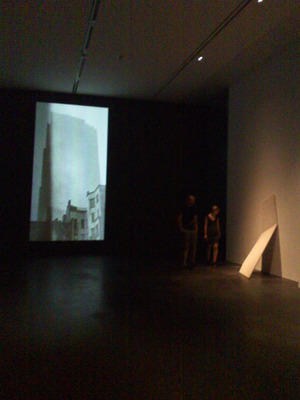
A video plays a big vertical projection of a building in New York City, the RCA building, a nice piece of early 20th C. architecture. It's fascinating to watch light hits the building in changing ways that really help define the 3-dimensional space of this cityscape. 

When I read more of the exhibition notes, I figure out that the artist, Erin Shirreff, has photographed sunlight moving throughout the day over an Ansel Adams' photograph of the building. I have some forward-thinking nostalgia about the experience of seeing printed matter in natural light at all times of day. This memory/recent experience is so unlike the constant light of a computer screen.

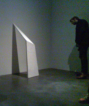
VictoryMonoliths.jpgIn the same room, are minimalist blocks of plaster by the same artist, who is currently artist in resident at the minimalist refuge in Marfa, Texas. Her thin planks stand braced against the wall, bent like something plastic, but now hard. The unnatural light from the cans on the ceiling make pretty shadows on the wall. These pieces are delicate, and mottled. Could be made of stone but they seem to fragile. And I'm warned by a museum guard not to get too close. I learn the material is plaster with an addition of Texas ash.

Here's the rub with battling nature: you may very easily lose. Shirreff added ash to the plaster, which weakened it, and didn't really make the fine waves I love to see in marble. Her technique left the planks susceptible to warping. And breakage. In fact, one of the pieces arrived broken. It is obvious she wanted clean, firm and natural forms.  It's a little too obvious this artist isn't used to physically making things.

To read or hear more UnsafeArt about this show, please visit Personal Victory.
Museum of Contemporary Art Denver: Another Victory Over the Sun
June 9, 2011 - August 21, 2011


MoonSea.jpgVictory over the Sun is the title of a 1913 Russian opera. Another Victory over the Sun is the name of the summer exhibition at the Museum of Contemporary Art in Denver.

What this metaphor means is debatable. It may be that the Futurists, soon to be Russian Constructivists, who produced the opera in St. Petersburg were defying the established order of high fine art and asserting that emotional intelligence is more powerful than rationality, which their predecessors valued. A victory of instinctual man over shiny, old rational man.

Maybe the works in this new Victory will shed light on the debate.

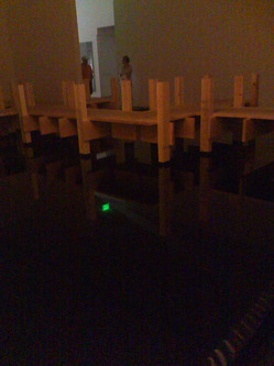
Take Between the Moon and the Sea by Spencer Finch.  A simple wooden dock is built in a large gallery.  A wide, but shallow black structure holds water on the floor and a lit, stitched ball plays the moon, hanging from the not-too-disguised ceiling.  In this space, one is invited to contemplate the moon and sea, as we are told is a Japanese custom.

MoonSeaDetail.jpgThere's a similar Colorado tradition: to stare at the moon and the stars far away from city lights. Going on a moonlight ski is a way to do this and snow provides the other surface like the sea. Shutting out the sun, like a non-electric camper's nighttime, does draw attention to the remaining light and this created dock-in-a-dark-gallery is a pleasant reminder of the revelations that come with a simple act of contemplating the moon.  

Contemporary art, after Pop Art, sometimes seems so much about pop and so little about what really flows deep. If that's what the Futurists where thinking was emotional intelligence as opposed to the rational world of worrying about paying the bills and making our e-mail work, then I think they were on to something.

To read more about this show, see Personal Victory.
PeepMilleniumPark.jpgWhen I walk into a Gothic cathedral I get what its creators hoped would be the original Shock & Awe Treatment. The containing of this much space exudes power. Commands some awe. Worship in the right souls, if not mine.

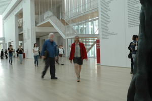
The modern wing of the Art Institute of Chicago is one more building in the new shockwave of awe inspiring architecture. Its volume made this institution the second largest art museum in the U.S when it was completed in 2009.  It was time we became another couple of its art tourists.

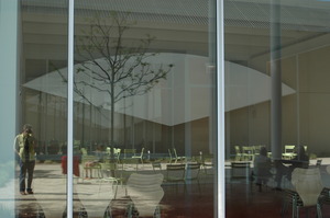
We walked up a long ramp from the botanic gardens in Grant Park and landed on the top floor in front of the rooftop restaurant.  Saw the new installation out on the high patio which was the subject of an editorial in the Chicago Tribune on Sunday - and noticed that it did indeed block the view to downtown, but gives a peephole to Millennium Park. After stepping off the vinyl of the patio floor, we descended by escalator between walls of glass to the first floor and into the expanse of the new glass and white metal building designed by Renzo Piano.

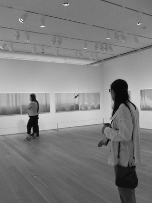
Modern-Wing-AI.JPGThen a fortunate thing happened. Right in front of us was the show I wanted to see: contemporary photographs by Uta Barth. Knowing now how much there is to see in this enormous wing, without even contemplating the impressive Impressionist stuff that's in the old building, I would have been challenged to give full attention to this small, two-room show.

Instead it became my grand entry to this amazing space - a beautifully sparse beginning worthy of a Coen Brothers movie. Barth's work is ethereal. Drawings without any lines.

They are photographs, and are essentially scenes. Interiors. An out of focus table, soft shadows of a glass and pitcher, or maybe a bottle. Not the things just the shadows of them.  A fragment of an arm and a hand's shadow.

The first objects I saw were a pair of 'couch sized' photos. No frames just the image mounted on a sturdy piece of white Plexiglas   - the hardware, the physical disappeared. The next images included little tangible stuff, little more than a simple orb of a ceiling lamp. The top edge of a couch made its way into the frame, too, but the real focus was shadow and light.

What do you think of these? I asked the guard, who let me know she'd had some time to look at them. 'I don't get it at all,' she said. They're just shadows. Maybe, somebody's house. Somebody who likes the way they decorated their house.'

barth.jpg'I think you had it right the first time,' I said. 'If somebody cared about the decoration, we'd see more of it. I think it's about how beautiful the shadows are. How they fall on the wall and what shapes and tones they make.'

I've seen light do this kind of thing before - been inside small spaces where shadows piled up on each other - and I thank the artist for reminding me to look.

Then I asked my friend what she thought. She felt like the artist was ripping off the craftsperson who designed the lamp.

We went into the next room and the photos were even more abstract - just curving lines of white on a undulating gray field. The gray was a textured curtain draping in waves like the folds of cloth on the characters in classical painting. The flow of white was a cast of bright light repeating this curling wave is a graphical way. Just a natural incident of light, somewhat manipulated by the artist playing with the curtain.  

Yes, she manipulated the curtain, she admitted on the curatorial card. And this is not normal for Barth, the info continued. She didn't modify the photographs, just helped the light fall in a beautiful way. So it's not naturally occurring shadows and light. Artist modified light, instead. I've heard many artists talk about their work with more evasion than a politician. This is the epitome of transparency. 

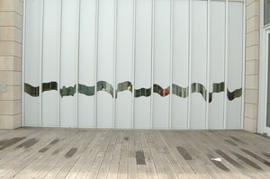
Uta_Barth_Ext_Art_Institute.JPGThere was another little space behind the wall where the photographs hung, and catalogs of  Bath's work were laid out on a white table with a single chair available to readers. The big windows to the courtyard were covered with white vinyl film with a little wave cut out so you could see outside. 'Wouldn't it have been nice with a curtain? my friend said. 'Instead of plastic.'

Thumbnail image for Art-Institute-Modern-Wing.JPGIt would have been so easy to ignore the subtle images Barth photographs, but seeing them made it easier for us to sense the enormous gulf between cloth and vinyl. We'd been given a little boost of Day Vision.

And then, we went back through the show, past the guard and she stopped me, 'Those shadows on the lamp are really interesting.. I've been wondering .., 'why'd that light land on the wall like that?' We talked about shadows a little more and went out into the courtyard where light was bouncing around like a crazy person.

I neglected to ask the guard what she considers her life work, but my friend, a lawyer by education, makes mosaics, and I write about the experience of looking at contemporary art.


A crafty day at the MCA

| No TrackBacks
Smith1.jpg'"I wish I'd thought of it first," says Frieda, one of the women who works in the cafe on top of the Museum of Contemporary Art in Denver.

She's talking about the work of Allison Smith, who makes replicas of, for example, an improvised WWI gas mask.

Smith's work is on view on the floor just below us and people are in the gallery with her making stuff as we speak. Frieda explains to me that Smith takes stuff that is involved with war and killing and puts it back into the everyday world through crafts.

Smith's show is made up of four easy to explain elements: a series of page-size collages that contain pictures of old household things, mostly Victorian, pasted to beige, hand-made paper; a 6-foot reproduction of an old-fashioned candleholder that bounces light from a giant electric candle; a half-finished braided rug; and display cases filled with the replicas of war items. 

The last one deserves a little more explanation. Smith takes cell-phone photos or downloads images of artifacts from museums. She then reproduces them with felt and other things you'd find in hobby stores.  The old items that interest her are ones that look hand made. Finally she tags them and documents where she found them. 

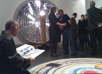
For the entire duration of her show, people have been braiding strips of fabric together to complete the big circular rug that lies in one of the largest gallery rooms of the museum.

Today, that room is filled with a crowd --mostly women-- carding sheep shearings into fiber, then spinning those into wool yarn that is then being woven on looms into a shawl. Teams of women are going from sheep to shawl in a friendly competition accompanied by nearly continuous lectures on fiber art and craft.

When the room hushes to hear Sara Goldenberg-White talk about the garments and installation art she makes from copper thread, aluminum foil and cloth, the whirring of the spinning wheels is the loudest thing in the room. That sound and sitting on a braided rug like my grandmother used to make gives me a down-home feeling than I usually don't experience in elite museums of art. And I am in one, not in a living history museum.

The next lecturer is a very smart woman - an art historian who is no stranger to elite museums of art. She talks about the craft revolution of the 60s and 70s, which she explained was the first real revival of craft since the Arts & Craft Movement, which Wikipedia dates from 1860-1910. 

Most people have brushed up against something from the Arts & Craft Movement: Frank Lloyd Wright, Art Nouveau, Lalique glass, Rene Mackintosh Celtic jewelry. I live in a craftsman house built in 1906 and have uncovered wall paper reminiscent of the style of that time inspired by  the Omega Workshops of the Bloomsbury Group, or William Morris, a writer and textile maker important to this movement. Morris was a socialist and his mission was to produce better-designed objects for everyday consumption by average people. Like my house - small, simple but still functional and nice looking 100 years later.
 
I don't personally know anyone who was working around that time but I have visited the home of Vanessa Bell, who was Virginia Wolfe's sister and a Bloomsbury painter. Tables, walls, bedspreads, bed, curtains, all are painted or printed. I don't think Ms. Bell expected any of her or her boyfriend, Duncan Grant's homespun work to be shown in an art museum and they aren't.  They are in a historical home run by the National Trust. Bell's and Grant's paintings can be seen in art museums.

To be shown in an art museum is, however, what artists wanted who worked in the 60s-70s craft revolution. People who worked in clay, glass and metal in this period were working to show that any material could be used to make art. They were taking up the mantel of the Dada artists who used found objects and questioned what qualified something as art. In the 60s, craft artists had a dog in the fight, along with conceptual, performance and other ethereal artists challenging what was art.

And what came out of the challenge, the questioning and deconstructing, is what we now call Post-Modern, the stuff after the modern stuff (Modern: imagine Picasso, Henry Moore) which followed the Arts & Craft movement.

And post-Post-Modern is what will be next.

At the moment, in the Museum of Contemporary Art, I'm experiencing Post Modernism. The lecturer, before she started discussing craft revolutions, sat on the braided rug and told me that the craft/art disparity had gone (almost) away like racial or gender discrimination. She's obviously right because craft is nearly filling this floor of the museum. 

 As I sit on the braided rug surrounded by novice rug braiders at work finishing the centerpiece of the gallery, I'm certain that this rug wouldn't win the Blue Ribbon at the state fair.

Sure, technical quality or craftsmanship was another of the things that went out when the art/craft/conceptual walls were torn down in the art world. We, post-modernists get it - It's not the craft but the concept that's important. If Post Modernism has a slogan, it's 'Anything Goes."

The art historian continues to speak about how people engaged in craft in the 60s and 70s to do 'an honest days work' because they were finding their day jobs unfulfilling. Making crafts were for 'self valorization.' And like religion they offer 'community' like a craft co-op, where people got together to sell things, which she followed with a list that included  'macramé'.  And this, she didn't mention, has lead to craft fairs.

A woman sitting on the floor sewing together the coils of the braided rug talks to me about how much she is looking forward to getting into knitting because it is so good at filling time. My sister says the same thing about her stitch-by-numbers copies of famous paintings.
 
But Frieda upstairs sees more in the stitchery that Allison Smith does. When Smith is making replicas of gas masks and candles, and even rugs, Frieda sees her work as a concept that she wishes she come up with first.

Frieda wouldn't say that about an exhibit of Anazasi corn grinders at the Mesa Verde museum. They differ because Smith has looked at the past and produced an object - useless to us - made of materials we can imagine. We can't touch them because they are in a display case, so we have to imagine. My imagination brain cells have a harder time making out what the original gas mask really smelled and felt like. I wonder if it was a hood of burlap, and if there were different grades of burlap. But those cells know colored felt from grade show.

I don't hear anyone looking into the glass cases saying 'oh, yea, my grandfather had one of those.' I do hear it said about the collages of antiques hanging on the nearby wall. And I hear the spinning wheels. And we're all thinking how post modernly accepting we are to have all this art and/or craft in one place while someone is talking about knitters as 'craft revolutionaries' looking for honest work.

Meanwhile, on the first floor of this museum is a show of work by Dario Robleto, a man who makes ceramics out of human bones and paper out of soldiers' letters home. No crowd of people is downstairs making ceramic wine jugs with Dario Robleto.

And then I understand what post-Post Modernism needs to be. Future art needs to give us more tools to differentiate quality and importance. Anything may go, but anything is also free to fail.  Oil paint on canvas is just as likely to fail as rug braiding. Any kind of music is good; it's just a matter of taste. No it's not. Some music is much better than other music. Fresh ground beef from a well raised cow is better than a frozen fast food patty. But those statements are so unPost Modern of me.  Maybe there is a bad piece of beef from a well-raised cow and I grind it poorly, and it is even worse than McDonalds.

While you're busy thinking, postModernly, about all the possible ways the patty is better than the fresh beef, I'm going to slip in another unPost Modern comment and start your deconstructing wheels spinning again to find me wrong. The giant replica of the candle & candleholder is poorly crafted, awkward looking and only partially effective at wowing its audience as its diminutive cousin would have done centuries ago. It doesn't belong in an elite museum of art.  The braided rug, as communal as I felt sitting there with curators, artists and knitters, mocks the other people who were in the room, who make fine and very fine functional objects.

Yet, I fall back into the Post Modern world where I live and realize I'm eager to attend the event where we see antique examples of curation, and hear the anthropological lecture on the lives of curators in the 21st Century. They aren't actually making art, so I'll be curious to hear what they do for self valorization.  And I wish there were more people, today, who could do what they really feel is valuable work.

..............................................................

Allison Smith's Piece Work is on view at the Museum of Contemporary Art Denver from February 4, 2011 through May 29, 2011.


Hermann Nitsch Talks at MCA Denver

| No TrackBacks
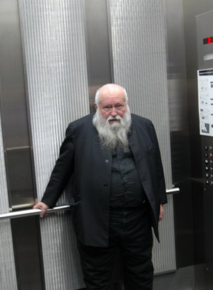
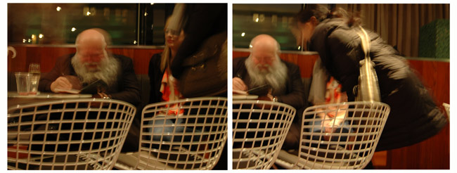
Artist Hermann Nitsch photographed by Steuart Bremner in the elevator at the Museum of Contemporary Art Denver February 24, 2011February 24, 2011
A massive body clad in black circled with a mane of a white beard, Hermann Nitsch is more than 70 years old, and the audience listened to him talk Thursday night at the Museum of Contemporary Art Denver treating him with reverence.

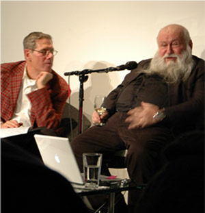
The audience jibed familiarly with MCA director Adam Lerner as he introduced Nitsch, whose half dozen paintings and dozen religious vestments are on exhibit in the museum. Warmly, but casually, they greeted the team of interviewers: Patrick Greanley, a European literature scholar, and curator Simon Zalkind. The audience hushed to hear the artist speak.

The Austrian started in English and when he got rolling switched to German, and Greanley peddled hard to deliver the translation quickly and unobtrusively.

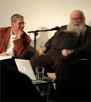
Artist Hermann Nitsch speaks with Curator Simon Zalkind at the Museum of Contemporary Art Denver February 24, 2011Artist Hermann Nitsch speaks with Curator Simon Zalkind at the Museum of Contemporary Art Denver February 24, 2011Zalkind asked questions I wanted to ask and with an intelligence I wished I had. My repetition of these questions is such a weak approximation: How did Nitsch get the idea to use performance so early, in the'60s? How was Nitsch influenced by Abstract Expressionism (a largely American movement important in the 1950s)?

It wasn't so much what Nitsch said -- he listed influences like Mallarme, Pollack, deKooning, many names that most audience members could pick out from the man's German with a good amount of effort -- it was the way he barely moved as he delivered the answers. And was rewarded with an odd reverence and hush. When he said Freud and Jung and John Cage, we felt we could lighten up. He'd sounded so ethereal, eclectic, and then it was obvious, performance comes from John Cage. This guy was part of the ordinary consciousness of his time. Then he names his special influence -- spirit. Not the kind bound to any religion, but the spirit that drives action. Then Zalkind pressed him on the weird nature of his form of self expression and Nitsch talked more about the all-encompassing power in humans and how it is bound too tightly by civilization. He's about unleashing all that human power.

Zalkind asks about Catholicism. Nitsch answers 'I was educated as a Catholic, but maybe not so well.' The audience laughed. Were allowed, by this point, to laugh with him.

Zalkind asked if intensity is necessary? And Nitsch light on fire. Yes. The intensity of smearing feces - he invokes Freud -- not that this act is not actually part of Nitsch's work -- but intensity is absolutely important. His intensity is making a ritual for six days where the participants act animalistically smearing blood and paint over themselves and the canvas on the floors and walls, or so it appeared from photographs. The theatre if a Mystery Orgy theatre, after all.

He goes on about: the intensity of Tao. The intensity of grass growing. The guy is bi-polar intellectually: earthly and ethereal. And we've all got our ears peaked up to try to make out what really is the answer.

A moped and Chrysler, he said, when asked if the paintings are art on their own, or does a viewer really need to be a participant in one of the Orgy Mystery Theater performances. The paintings are merely documentations of the act of the theater. And the theater is just a release of some human power, a diversion from how it could be released violently with worse effects to humanity, but instead is a release that empowers each participant. How does it do this? We don't get the answer.

Does the exhibition do this?  The flowers in the room smell. The blood in the paintings has dried brown on the canvas, been layered under red paint and been stamped with foot prints. You'll have to add the intensity yourself. I want to taste the blood. I want to see the theatre.

The paintings are the moped, Nitsch finally said. The event is the Chrysler, and we're all invited to participate in his next event in the summer of 2013 in Austria.
Hermann Nitsch signs the catalog of his exhibition at the Museum of Contemporary Art Denver

Bloodlines - Herman Nitsch - MCA

| No TrackBacks
Required reading - exhibition notes -- Feb 4, 2011

Photoshopd-Nitsch.pngGlasses pile up lonely on small tables - half drunk, some empty, rings of wine at the bottom, inches left in some of red, some of urine yellow - abandoned outside the big gallery rooms.

It's a three-show opening and there are plenty of people at the Museum of Contemporary Art tonight. As I head off to the quieter side, I feel I'm sneaking into the bedroom to get some space from the party. In one big gallery is the work of Hermann Nitsch. The show is called Bloodlines.

Paintings on the wall are big, covered with red from edge to edge with drips - streams of red - and red footprints. Vestments - priests' garb - are displayed like saddles over saw horses, like Indian blankets at a flea market. This isn't craft elevated to the wall like a famous tapestry; the robes are folded to look like the priest is still in them, kneeling before the altar. There are several, maybe a dozen bold, multi-colored robes lying there in a much more intimate and ordinary way than I've ever seen vestments. They are not protected by a sanctuary or even a docent. No one advises me not to touch. And coming so close, I can see that each one took someone a long time to make and has suffered some wear over time.
    
Flowers are in the room - bright ones - like the robes - but I'm not sure it feels festive. More like an after-the-fest feeling. Religious images are pasted on some of the paintings, but no pang of sacrilege hits me. I'm reminded instead of the bad aesthetics of many an American church.

I grab the exhibition notes and proceed into a little hallway, jag around alone like I've found a secret passage. The nearby gallery is dim, and quiet like the one I just left. In the passage between them, a view opens to the main level: people drinking, laughing. Someone is running overhead and I can see the feet through the ceiling windows. 

Bloodlines - I read in the exhibition brochure - are paintings Nitsch made with blood (and mostly paint) in his studio and at a certain kind of happening the artist has directed since the early '60s, happenings called Orgy Mystery Theater.

When I arrive in the dim, next gallery, I'm oddly alone, like I've just missed something again. I can always feel regret when I think of having missed all the important art happenings, sit-ins and Woodstock. There are flowers and music and lots of red dominating the gallery space. Another priest's robe, painted with thick green paint, is stuck on the largest painting.

Not taking sacrilegious offense, I feel some Catholic guilt, the same guilt I feel being a tourist in a famous church and not doing the holy water routine. It's the guilt of not being a member. I don't dwell on this, I read the exhibition notes.

Nitsch, the brochure says, creates events where he makes these paintings. People get drunk, start smearing blood around and do who knows what else. Like the society in Lord of the Flies, the Orgy Mystery Theater drags in the participants, gets their hands dirty, makes them part of the pack.  I imagine that Nitsch creates a ritual that would be like one I could have had at Woodstock.

The notes tell me Nitsch means the event to be a cleansing ritual, a renewal, with blood that doesn't just cleanse, but also stains - hands and canvas. I get it. You get to be part of the mob, but the next morning, there is the guilt. The remo's.

I don't know if you need to have once been Catholic to know this guilt; it was certainly part of my catechism. It's a guilt that comes from having enjoyed something you know was wrong, or at least, you were told it was wrong: Rock&Roll, not wearing the burqa, drinking alcohol before your 21st birthday. And of course kids are busy doing the later because there is pleasure in guilt. And there are so few things a modern person needs to feel guilt about. So few that we, often, go out looking for them. 

I own the guilt of enjoying being Catholic and participating in the meaningless rituals to the point that I can still sing songs like the Gloria or that my arm knows how to make the sign of the cross although it quit doing that when I was 16. I can understand the satisfaction of guilt from being part of the pack, my pack that feeds on fears and offers illogical solutions. A pack that is one of the major causes of overpopulation.

Since the memory of being one with the mob, a conformist, a reciter of Latin gibberish can still give me a thrill: the big space, the meditation, the inspiration for rebirth, the passion, the mystery, I can easily imagine an orgy mystery theater, and how it might be rich with emotional food. 

When I look back up at the paintings, the blood-red is nothing like the red blood of Christ whipped up in my memory. The paintings are not vivid red as I had imagined, but more akin to faded abstract expressionism. 

An ordinary viewer can add too much. Or this show works to give a small glimpse to all the emotion and a big load of the remos.


Bloodlines, an exhibition of the work of Hermann Nitsch opened at the Museum of Contemporary Art in Denver, Feb 4, 2011. The artist will speak at the MCA on February 24. 

An Instinct Toward Life - MCA Denver

| No TrackBacks
by Terry Talty
February 6, 2011

I'm a freelancer and - as my friend delicately put it - there's a gap in my schedule. Nobody loves you when you're down and out, so I hate to mention how down my financial future seemed to me last night. It could just have been the weather.  Snowing for a week, no sun and frigid. So unDenver like. Snow, sure, but never without sun in between.
Instinct001.jpgAnyway last night, I'm worrying about worldly things and I'm at an opening at the Denver Museum of Contemporary Art. Tons of people mill around me to see the three new shows. In retrospect, I can name the three by the method of getting in your face: Bones, Blood and War.

On the entry level is the work of Dario Robleto in an exhibition called "An Instinct toward Life." I'm standing in the white, big gallery surrounded by small things, spaced far apart. Bone and other human parts went into the art objects - that's the buzz in the room. Such a provocative theme should provoke me to gush with ideas, but the few thought bubbles arising are my same old ideas.
 
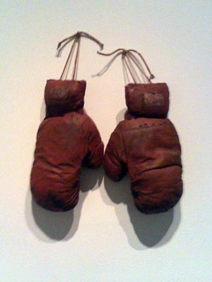
The boxing gloves (pictured) are titled The Melancholic Refuses to Surrender and reminds me why I hate boxing movies - the unnecessary pain of some sports. Broken male hand bones are just one of the listed ingredients in this piece and The Hustler. 

A wine jug, called The Skeleton Wine has a materials list that includes 'cast and carved bone, bone dust from every bone in the body, ground wisdom teeth.' And 'homemade wine'.

Next to the wine jug are a collection of little pitchers the white card says were used to feed invalids - apparently a while ago before the invention of the IV - with the title, "A Ghost Nurse Still Needs to Care." 

'Made out of bone,' my friend, a sociologist says.  Like bone china, I say.

I nearly trip over a pile of dinosaur and human bone dust on the floor as I dash off to a quiet corner to look out the window and take a phone call from my son. He's in traffic and I'm in a crowd and we can hardly hear each other. This happens more often than I want to remember and I promise to call him back. He promises to do the same and who knows what audio quality chance will give us next time.
Instinct002.jpgI step back over the dinosaur and human dust. I do think, at that moment, about how my body might decompose and rejoin the earth after I'm dead. I've never been a fan of a niche in a cemetery. I want my dust to be spread on the garden just like my grandfather-in-law was added to his bean trench. I mentally follow my future remains through the ground, into Denver sewer system, down the Platte into the Gulf of Mexico, possibly reincorporated into fly, then fowl, into New Orleans chef. I feel disappointed, however, because these ideas were not new ones to me. I'd already used them for a short story.

When you get old, my uncle once said, you never have a new thought. You just recycle the old ones. Uhg.

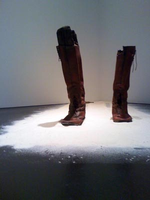
Instinct003.jpgIn another corner, a pair of boots is standing in a pile of dust. Human bone dust, I guess. Inside each boot is a wooden leg. Carved by soldiers - amputees - my friend says - from the Civil War. I couldn't get close enough to the wall to read the card. 

The curator, Nora Burnett Abrams, associate curator of the MCA, says the cards on the wall are poetry and invites everyone to read them. My sociologist friend says the artist told her he writes the cards first, then conceptualizes the physical work. He's into metal detectors, she says, he finds lead bullets and wedding rings on battlefields. Human ring finger bones are in the next room covered with some of this lead.

Are you cringing yet? Or are you feeling as ho, hum as I'm feeling?

Whether it's fair criticism or not, this show has failed to seize my brain, and get me out of my funk.

Look at the world I'm living in. A place that needs Payday Loan shops. Not that I have a payday in my future. If I go to work at McDonalds I'd have to work more than 62.5 hours per week to make $2000 which, cut by an immediate minimum 15% for taxes, would barely cover my half of the mortgage, my ever-rising health insurance, food and bills. And I couldn't work at McDonald's alone, I'd have to get another minimum wage job at Wal-mart because they won't let you work full-time. They'd have to pay your health insurance.

Imagine a mom and dad having to work this much. No way they could take care of their own kids or ever cook a meal. Or go to an art museum.

Sure, tonight was an opening, so it was free, but I still had to rifle through the change drawer to get the train fare. And have the time.  And a couple of brain cells that aren't overloaded by responsibility and money trouble. When you're worried about your next job, or if you can ever settle your Pay-Day loan, you can't think about art or anything like it. You'd be lucky if you could hear a full sentence on one of the TVs that are constantly blaring at your workplaces.
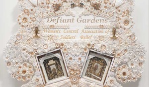
Robleto-Defiant-Gardens.jpgI'm not criticizing the craft of the work. The artist has contrived each piece into a form that is a pleasing design. The ceramic jug doesn't look as strong as Wedgewood, but it doesn't need to be. It isn't intended to be functional.  Nor am I sure I want to criticize the shock value he's going after by using human bone, hair samples and love letters. That artwork reaches to get someone's attention is not a crime. We're all required to do some marketing.

I'm just saying that a concept can't generate feelings that the artwork doesn't corroborate.

Because each of Robleto's handmade objects is small, each has a natural intimacy. I should start to have a connection to the humans that might have used such a thing, but he add the same distance a history museum can't quite eliminate. He lines up the invalid feeders on rows of shelves, has a kaleidoscope pointing to the man/dinosaur dust, hides braided human hair flowers in a giant nest of craft-project paper flowers.

And then, there's the poetry. On the jug in The Skeleton Wine is an inscription "Scrubbing Your Soul Won't Make it Clean,"  and the following materials list:

Materials: cast and carved bone, bone dust from every bone in the body, ground wisdom teeth, homemade wine (water, sugar, fermented grapes, black cherries, plums, red raspberries, yeast, gelatin, tartaric acid, pectinase, sulfur dioxide, oak flavoring) fortified with calcium, potassium, creatine, zinc, iron, nickel, tin, copper, boron, vitamin K, crushed amino acids, glutamine, chromium, sodium, magnesium, colostrum, phosphorus, iodine, microcrystalline cellulose, quartz, rust, water extendable resin, typeset, driftwood shelf.)

What difference does it make if there is wine in this jug or not? We can't see it. We have to trust the artist that he has actually used any of the listed materials. It's a leap of faith and I'm not sure why I'm being asked to take this leap so that I can look at these materials in the new forms that this artist has made. Am I to scrub my soul with homemade wine and the blood of Christ, and still have to grab for the Comet?

If the artist is trying to inform me - explain what it takes to make wine - it's a self-serving attempt to gain my trust.

If the objects are made to deliver poetry in cleaver titles, then does that work? 

The piece, A Defeated Soldier Wants to Walk his Daughter up the Aisle - the boot - is made with wooden legs that Civil War amputee soldiers carved for themselves, the card verifies when I finally have a chance to read it. And the boots are World War I standard issue. I'm not trying to be a stickler for accuracy but when things don't fit logically they lend themselves to comedy. According to philosopher, Noël Carroll, incongruity is at the heart of all jokes. The titles makes the campy object a joke. Like a fraternity trophy used as a beer stein.
 
What gives me the most outrage is that Robleto has somehow sucked the ink off soldiers letters home and made them into dye for one of the pieces shown here. Maybe the soldier was a bad writer, but if I was his/her kid, I'd want the letter.

The arrogance of the artist, thinking that someone would wish their bone or their ink anonymously included in his ceramics or paper-making projects, is glaring.

I'm usually as willing to laugh at campy stuff as the next Post Modernist. Tonight, however, I feel like such an ordinary Joe, weighed down by real or imagined financial worries, that I'm not sure I'm the most open observer. Like an ordinary observer, I feel outside. And from here, it looks like too much of contemporary art is an inside joke.   

  
Terry Talty, who writes this blog, pleas for forgiveness for being a downer: Please do read the next installment, which is sure to be more optimistic. Sign up for the RSS feed, if you can spare the time.


Reminising on Energy Effects

| No TrackBacks
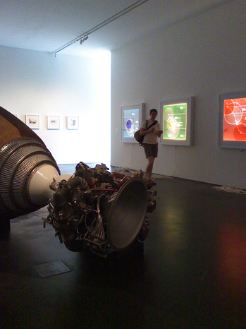
While the show Energy Effects was up at the Museum of Contemporary Art in Denver (Jun 16 2010 - Jan 16 2011) I visited it several times. But one night I went with a couple of people and we sat upstairs in the cafe drinking a cocktail.

My friend Karen, whose day job is something techy, thought the show had some down to earth qualities that really would improve the lives (maybe just slightly) of anyone who took the time to look at things in it -- like the Trident rocket or the reproductions of one of the original nuclear fusion devices. She felt that the white cards on the wall describing the pieces has an academic quality that was so high-brow it was almost facetious.

So we make a dream catcher - one of those folder paper crafts we all made in grade school where you pick something on the outside, the operator moves the dream catcher and you pick the inside 'fortune' and the operator reads your fortune by opening the flap and reading what's below.sandal_Le_Courtois.pngWard_Shelley.jpgtitan_rocket.png

Our dream catcher contained our version of the  'white card' explanation of the pieces we'd seen. First, we gave each piece an easy to identify title (and then I'll explain what it actually was, and then the 'dream' curation (white card info)

Trip in Desert: A video of a man walking away from the camera by Unknown 2 Me.
The vanishing point is illustrated from life size to dot - illustrating the futility of human effort.

Running of the women: A video of women being groped on a crowded street after a soccer game in a S. American country by I'm not Sure.
Fear of the unknown - when human interaction becomes like corpuscular organisms reducing human feeling to insignificance.

Car/Pointing into a Pond: A life-sized car out in the parking lot balanced on its nose/grill in a pool of water and a photo of this kind of car at the second it hit a body of water by Gonzalo Lebrija
A tribute to ephemeral nature of art -- the ah in ah-ha that means something to us as the non-real producing the real.

Stature of Liberty: a miniature statue in the eye of a needle that we viewed through a microscope by micro-sculptor Willard Wigan.
Belongs in the World's Largest Collection of the World's Smallest Things as the biggest gift given to the U.S. by a foreign country that we no longer find to be a big country.

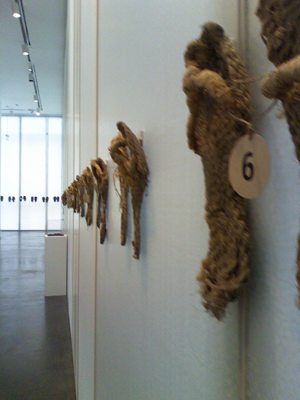
Sandals on the wall: series of worn-out, handmade rope sandals used in x years of the artists life by Viviane Le Courtois.
Physical outcome of energy expended in daily life - there is surplus after utility.

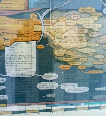
Artist's Graphs: beautiful drawings that visually diagram the artist's (Ward Shelley) love life, his view of the history of art, and more.
Vascular 2nd graph of a life begun with deconstruction that became a life of its own.

Particle Accelerator: recreation of a 1930's nuclear fusion device by Jim Sanborn.
The interplay between science and universal destruction is illustrated by the size of a devise compared to a particle.

Titan Rocket: paid for by the U.S. Government built by Lockheed Martin
A merger of science and extreme aesthetics pursues an unjustifiable economic expenditure that is unlikely to directly benefit its tax payers.

SITE SANTA FE BIENNIAL 2010

| No TrackBacks
Dissolve - or Try to Stand Out
June 24, 2010

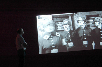
Site-Kelley.jpgSANTA FE, NEW MEXICO - A panel of a half dozen people sat brightly lit behind microphones and glasses of water, in a dark auditorium in Santa Fe. Two women took turns speaking, composing their sentences slowly, deeply considered each word before it was uttered. The two women spoke as if they had been struggling - and not always successfully -- to save lives in peril amid atrocious conditions. We were late, having driving straight from Colorado to make this mid-day lecture, and fumbled for seats in the dark. We'd missed any introductions, but watched the images being projected on the wall and figured out who these women were and with what they were struggling. They were trying to make art.

We would see their work in the 8th annual SITE Santa Fe Biennial, which was opening the next day. The show is called The Dissolve, and is all animation. These artists, Kara Walker and Mary Reid Kelley were helping to open the show by discussing their work with the curators in front of the public. And their seriousness gave us the hint that The Dissolve wasn't going to be Saturday morning cartoons or Pixar.

Guess what it would be? Flickering images in dark room...yes. Citizen Cane, Gone with the Wind, Birth of a Nation ... colder, colder. Fantasia, spin art, Monty Python ... getting warmer. At least 40 moving images including short, tricky, comedy films from the dawn of motion pictures to the animated shadow play Walker recently finished about racial violence. TV in a contemporary art museum demands more attention that sitting at home with a bowl of popcorn. Just watching a movie with other people you get a sense of what makes other people laugh or sob that you don't get by slipping in a DVD.

Watching TV in an art space is usually annoying because you can't get away from the flickering or the sound, and there are still and quiet things you want to see. The Dissolve eliminated these issues by eliminating the still. 

The curators explained how hard they worked to give each piece it's own space. David Adjaye, an architect who designed the Contemporary Art Museum in Denver, designed the show, and everyone was raving about it.

So, the next day, we step into SITE from the blazing New Mexico sun. Airplanes fly across a 6-foot screen. The airplanes pretend to be drawn on a flipbook.  Hiraki Sawa has recreated my first attempt at making animation - drawing a picture in the corner of a book and purring through the pages - but somehow I realize while looking at this video that he faked it. The pages don't actually diminish to the end and I'm not sure that the airplanes were actually drawn. This disappoints me. But the B&W moving image is a warm, a little nostalgic, welcome. Peeking around it, the big warehouse space is glowing, spaces delineated with red, deep blue and a veiled green.

Around the first corner, a toy car scene lays on a table. Video from four cameras is spliced together as if an automatic TV director is calling out 'close-up,' 'two-shot,' 'wide-shot,' etc. This show plays above the toy scene. The subject is a traffic jam, we can tell by the sound of honking cars, and the title of the piece "Traffic #1, Our Second Date," makes it personal. A tiny, toy couple watch the jam from park benches. The expression on their faces (close-up) is fascinatingly always the same.

Seeing film and the filmed at the same time is not often possible, but we know it exists. Jennifer and Kevin McCoy gives viewers the immediate experience of it.

On a long wall where several videos play, in one, a man dressed like a butler in tails is drawing a picture on a large sketchpad. He  draws a bottle of wine and a glass and then plucks the real think off the board. This film was made by the Edison Company to promote the idea of moving pictures sometime between 1894 and 1918. I can imagine the people who made this little old film, and I don't hear them talking like angst-driven artists. Its inclusion in this show puts the struggle to make relevant video art in 2010 in historical, real-world perspective. And the genius of art is much harder to accomplish than a gag.  

kara.JPGOpposite the cleaver promo film is Kara Walker's saga. Paper puppets move across the screen in silhouette. The racist (especially if you think it's racist to denegrate the Redneck) storyline taken from the real history of criminals and assholes that Walker has researched is not clearly spelled out in the film, but the imagery is beautiful.

The sound is subtle - old-timey jazz - although the paper characters are in a horror show of rape and denigration. The strings or sticks that manipulate the puppets are obvious and the film takes advantage of four dimensions. Time, and the usual three.

So we know the figures are puppets, we know which characters are the Rednecks and which are the Negros by the profiles of their stereotypical hair and lips. The silhouette and flatness of the puppets - the total style of Walker's work - are easy to relate to historical art from Africa and emphasize black and white. In every second of video there is something being communicated and nothing gets in its way.

Walker's work, Six Miles from Springfield on the Franklin Road, is 25 minutes, an epic among so many pieces, and I can't take it all in in one sitting. There's so much more to be seen..

Jacco Olivier makes a finger painting, and another one, and another and links them together as a moving film with a similar plot to Avitar. Lush in color, it is less than 2 minutes long. We might not have criticized the story line if Avitar had been so short. (Same can be said for a few of the more narrative (not really fully narrative) videos in the rest of this show.)
crepe.JPG
Another flawless (given the time we have to devote to it) is About to Forget. In it, Berni Searle lays a cut-out silhouette of three clumps of people in a tray that is filled with water - we can hear it being poured - and red dye from the paper dissolves into the water in front of our eyes on three different large screens. You know you've seen this paper before. The texture is something you understand but can't quite explain. The bottom edge of the paper is crinkled and the figures seem to be standing in a natural landscape that's loosing all its color. One of the silhouette forms doesn't quite stand up. It flops onto the bulk of the paper. It confirms that the image was made with paper. The red dye leaves the paper and swirls around in the water until the whole scene starts over again. Better than a lava lamp.

Site-Biennial.JPGI followed the show in the suggested viewing order and at this point, entering a circular room made of gauzy drapery, I started to feel overloaded. The room is busy, quiet except for layers of whispered content coming from speakers directly above the viewing area.

I got sucked into watching an older woman in costumes of obvious types: nun, sailor, cowboy. These change every few minutes. She appeared to be singing something in German, a traditional folk song, maybe. The costumes related to drawings layered behind her, but I can't understand the German. There are a lot of people in this gauzy-green room, and four other videos demanding attention. I placed myself under the speaker and got lured into the singsong of the German woman.  I try to make sense of the other works. Random images. Random narrative. Sure, there's some cool drawing, cool photo and digital images, but not much clarity.

DAY TWO
Afraid I was going to miss some bits of genius due to overload-blackout, I left the green gauzy room and walked out of SITE. Three gems would have been missed if I hadn't come back for a second try days later.  One was the work of William Kentridge. Watch someone draw, erase and redraw an image as it tells a story. Nothing like watching paint dry; it's beautiful; vivid gray smudges remind you of what was drawn like your dreaming it.

Two, Cindy Sherman's short piece where her image is a paper doll in a package. A true breath of clarity. Herself, as the paper doll gets put in different costumes, then packaged away..

And more clarity appears in a series called Black Stuntman by Robert Pruitt. Black Stunt Man is an ordinary black guy, facing ordinary troubles with a costume - pencil drawn, of course. A narrator describes him in a matter-of-fact-way, accompanied by hip-hop music, with insightful references to the way it is.. 

Black Stuntman is one of several videos in a big square room. There is a big screen showing the work of one of the angst-filled women, Mary Reid Kelley. The script of the piece is a pun-filled poem called 'You Make Me Iliad'. The iambic pentameter poem is read for a camera by the serious voice of its creator. The look of this speaker and the other characters who represent German WWI soldiers reminded me of an old B&W cartoon of Mickey Mouse. They are dramatically made-up to look like original Mickey.

This connection is suggested to me because there were several other films from the early cartoon era playing in the same room with the Iliad. On five airplane-sized screens, I could watch one of these and keep an eye on the Iliad sing-song on, as a visually dramatic, large screen backdrop. The poem is nonsense. Cleaver figures of speech, alone, do not make exceptional poetry. The whole piece offers a little more Mickey than Mouse.

By this time, I have several hours into this show and still am missing something. Months later I visit Santa Fe again, and see the dance piece by Bill T. Jones and OpenEnded Group, called After Ghostcatching, a Virtual Dance for Stereoscopic Display. Lines of colored light describe the moving body. It's beautiful. 

If the success of an art exhibition is how many hours I can be entertained by it, then this 8th Biennial is one of SITE's most successful. 

Terry Talty writes about the experience of being human and looking at contemporary art.


SITE Santa Fe Biennial 2010 is all video.
June 20, 2010... Santa Fe, NM

rain2.jpgSITE Biennials make this warehouse space feel small. SITE, a big, contemporary art exhibition space at the corner of Guadeloupe and Paseo de Peralta in Santa Fe is now taking advantage of the fourth dimension in order to accommodate the 2010 biennial. And for every piece included, there seem to be infinite variations.

To see thirty images, walk through the show at a normal pace. Then, walk through again and see another 30. Entertaining yourself is easy. See the image on the right? It's rain falling.

Here's another simple pleasure, if you just have a few minutes. Watch the Oscar Munoz' piece, where a video camera runs while someone draws a face on concrete with a wet brush. The drawing evaporates before it can be completed and the image's expression on the screen changes as parts disappear and are redrawn. Sometimes we forget that it is in the processes of being drawn, but we can see the hand. And it's moving as fast as it can.
Site-Munoz.jpgAt right,Oscar Muñoz, Re/trato, 2003. 
 
The setting is mesmerizing, and was created by David Adjaye, the architect who designed the Museum of Contemporary Art, in Denver. Black and white images flicker in what feels like a red room. A circle of always-different images is draped in a green room. Sound is coming in from above, isolated for just the viewers/listeners standing below it.

In this biennial, the curators, Sarah Lewis and Daniel Belasco, incorporated a brief overview of the history of film and video from a 'aaahhh' kind of perspective. Every piece, new and old, they said, has 'that something special' and although they were as vague as the word 'aaaahh' about what that was, each piece made sure to show the human at work behind the technology. Aaaa-haaa..

SITE is a closed box, and can be intimidating to people uninitiated to it. In the past, I've passed through a gauntlet of weird sculptural debris, or had to walk in without any idea of how to find the door, but somehow for this show's opening, the grounds outside are decorated with groups of people talking about the work -- almost a film fest atmosphere without the celebrity hype. The darkness of the big space, at first, makes this show seem too difficult for an average Joe to understand. But when you ask anyone coming out of the space what they saw, what they thought ... you get a self surprised, 'it was cool.'
 
But to really look, is consuming. So, I'm going to go outside now and talk to some people about it. Back, soon.

One on One SITE Santa Fe 2010

| No TrackBacks
Adding or Subtracting from the Chaos

Solo Shows at Site Santa Fe

allen-terry-rodez.jpgSANTA FE, NEW MEXICO - I'm standing in a gallery reading poetry. The lines are carefully placed on drawings, and are trying to give me a lesson on Antonin Artaud, a French Surrealist and dramatist. I read the poetry and wonder if I am part of such a shallow society that information must be accompanied by pictures in order to be enticing.

The drawings with attached poetry are the work of Terry Allen, and the piece is called Ghost Ship to Rodez. It is one quarter of the current show, One on One, at SITE Santa Fe, which runs from Feb. 6 to May 9.

The words making poetry could either be Allen's or Artaud's. (My guess is Artaud, but even Google won't confirm if I'm right or not.) I get a nice hit of thought provocation from the first image and words I see, and intently read. My friend doesn't like the imagery that goes with the poetry - rats and other nasty stuff - and she leaves after a quick stroll around the space. Here's an example of what is fitted under the rats and crows:  'do people in heaven dream about hell,' 'do they wish they'd had been a little more sinful in life and repented at the last minute.'

A score these framed drawing line the room and tell the story of Artaud's trip to Mexico in 1937 when he was trying to quit heroin and take up peyote. He was having a hard time. He imagined all kinds of things coming out of his body. He may or may not have been successful looking for trouble to fuel his art, but his troubles got worse. Soon after leaving Mexico he went to Ireland where he got arrested and deported. He was sent home in a straight jacket, chained to an iron bed in the hold of transport ship for the duration of the 17-day cruise.

Next door, the artist is trying to further describe this extremely frightening experience. The photo shown here represents the installation well and is part of a virtual gallery tour on SITE's website. I can imagine I'm supposed to feel Artaud's pain, but my experience is a little more like looking at the photograph. The shadows are beautiful. The form are interesting.

One of the parts is a woman with a Texas accent telling a disjointed account of Artaud's story from six different screens suspended from a contraption that's a cross between a spider and an anorexic android. Not easy to understand. In a corner, is the other form, generating a breathy, whoshing sound. Symbolically, it is a sailing ship about 10 feet long and almost as tall as the ceiling. There are sails that move in a created breeze, and a bed that represents the deck. Beneath is a sea of books. Earlier this month, Allen and his wife, Jo Harvey Allen staged a play he'd written, also called Ghost Ship to Rodez, and maybe these were used as the set. I'm intrigued by the forms but I want them to communicate more. And the quabbling sound sends me out for refreshments like a bad commercial.

I look for some human contact. I can't talk to everyone about art like this. My eyes randomly land on one of the drawings -- 'he was so selfish, he had no understanding of what selfish was.' Who would admit such a thing if it were true about themselves, I think, and start to feel guilty for my own ignored blind spots. Overbearing. I didn't know what that word meant until very recently. Or heartburn, until I was pregnant.

Luckily, I started talking to someone who spends a couple days a week watching this show as a museum employee. She asked if I had any questions. I think someone at SITE knows that if a viewer hasn't taken the time to read the pamphlet about the show, they won't get very far in understanding it. I ask what experience she had with the show.
   
She brings school kids in, and they are not given a lot of advance prep. From looking alone, second graders, she says, can tell that all of the framed pieces and the two installed images are about one person. They can tell that the person was having a hard time.

She, a grown up, calls the story an existential crisis.

We talk just outside the room with the whispering Texan woman and I realize I'm torturing myself, as if I needed a nagging heroin withdrawal, by not leaving the room.

Maybe it's not worth writing about art, I say looking for more punishment

A few months ago, well several times over the past three months, I've visited a piece by Samuel Becket at the Museum of Contemporary Art, in Denver. The piece is one woman, speaking a monologue clearly for 14 minutes, with her face blackened so only her lips and teeth are visible in the dark room. Every phrase of the monologue starts my mind turning on the question of my identity, the idea of the self and how it is perceived differently from the outside and from inside, and changes with every moment. I know it is Beckett's words that do it. They are poetry. Spoken quickly, but clearly. For 14 minutes.

I'm longing for a little clarity in this piece of Terry Allen's.

The museum employee and I go to the next room, and look at the work by American artist Hasan Elahi. He was detained after 9/11 and falsely accused of being involved. So, through this work, Tracking Transience, he is in the process of thoroughly documenting his life -- taking photographs of everything he eats and many of the places he's shit. These are cycled through an array of screens the roughly represent the United States. On another was, his credit card bill for the past 10 years scrolls by like flights on an airport screen. A program designed by government researchers to predict a person's whereabouts runs on a semi dome like a very complicated constellation map. SITE built the globe; it's quite beautiful. As a life document, this room is more cold and inhuman than Facebook. Do we have a life if it isn't documented in some way? I wonder. If a life falls in the forest and there is no one there to hear it, does it make a sound?

Does it have an existential crisis?

Primordial Humaness

| No TrackBacks

Looking for the Face I had before the world was made
by Terry Talty
January 30, 2010

borremans.png
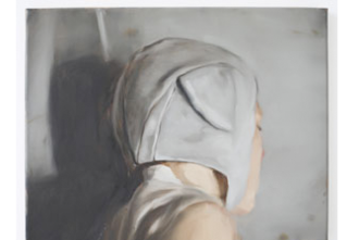
Paintings by Belgian artist Michael Borremans at the Museum of Contemporary Art Denver.

DENVER, COLORADO - Representing the human face in art is a little like telling everyone who you're sleeping with. You're admitting what you find attractive (akin to buying unusual art - you must like this weird thing  - it says to anyone who might see it in your house).

When you paint heads, you're showing what you think is human. If you paint with accuracy and copy every detail of a face, you're placed in a sub-genre: photorealism, or worse portraiture. Like the artist/photographer in the neighborhood portrait studio, you're an artist with the narrow vision of seeing just one face. And this is a valuable mission when you're hired by a high-school senior to make something for the yearbook. It's a different mission to paint what you want to represent humanity. Many contemporary artists use a cartoon, a symbol, or some other kind of messy mark or gesture to depict the every-face. Michaël Borremans blur some, and focuses well on the nondescript parts as he works to find another way to that universal face.

The show called Looking for the face I had before the world was made is six-different exhibitions by six artists that opened Jan. 29 at the Museum of Contemporary Art Denver. Borremans' paintings, about 10, are in the main floor gallery.

The faces in the paintings are not engaging the viewer. We are looking from the back of heads, at someone looking away, at the profile of an artist intent on something oblique to us. The colors are somber and in one, the subject is a thorny stick leaning against the wall. In one, the figure is wearing a tight cap that seems to have mouse ears sewn onto it.

'No one would be caught dead in such a hat unless it was a costume, says my friend, nudging me. My friend has the rare profession today of being a housewife.

MCA)@.jpgThe universal face is on the other side of that hat, looking into the picture frame with us. But as my friend said, that hat is drawing our attention to her - the feminine subject.  Inside another frame is a brown-haired feminine subject looking down at her hands. No facial features stand out. Two figures are standing in the dim gallery light looking at this canvas. One brown-haired female looks like the painting. I take her picture on my crummy phone camera. The other human is a guy with too much apparent individuality to be the universal. One side of his head is shaved and the other - I can only see a dark line of hair at the crown from my vantage point - seems to be the barbershop classic, the taper.

Try to mentally draw this threesome as the universal. The guy can pose showing his left or right side and play the part of twice as many characters.

I let Photoshop help me try to find the 'common human.' I eliminate until I get there, worry I've taken away to much, or kept too much. When I'm done, I'll mentally put this face, these faces, in a scene that we all do: look at our hands, scratch an itch or turn away from someone looking at us. Give it a try, and then come back and look at these paintings.

MCA01.jpg

The primordial human face -- one to whom we can all relate -- is cold and sad like the feeling in this gallery. We are not inside this human. We are looking at it from a separate skull. The feeling is completely different feeling than the Renaissance window to the world where we look into a picture and buy the illusion, as if it's a window onto a painted scene.

There is one painting in this show that has this traditional perspective just to remind us that looking at the face that is not engaging us, is different from looking through the window with the artist. Its subject is simply an open magazine. We are in the mind, behind the face, of the universal person looking at the open pages.

I'm pretty sure Photoshop and I have a long way to go before we finally create the meta-face, but when I look back at the Borremans painting where that I was trying to understand in that exercise, I notice they are not like the open magazine painting. They don't prompt me to feel 'hey, we're all looking at the same stuff. I can really feel I'm seeing with that figure's eyes.'

Instead, I question, 'hey, is that what I look like to the world?'

The name of this exhibition, of which these paintings are just one part, is "Looking for the Face I Had Before the World Was Made," taken from a line in a poem was W.B. Yeats. And if Borresmans has found the face that we had before the world was made ... have I always looked that alone?

MCA Denver: William Stockman

| No TrackBacks

In Human Scale

Looking for the Face I had before the world was made
by Terry Talty
January 29, 2010

William Stockman drawings at Museum of Contemporary Art Denver
Drawings by William Stockman in the paperworks gallery of the Museum of Contemporary Art Denver.  Photos:Terry Talty
DENVER, COLORADO - Like pages from a journal as big as my arm's span drawings hung from pushpins in the paper works gallery of the Museum of Contemporary Art in Denver. Each page was a sparse scene of people in action: a man in a small boat reaching into water for fish, a woman with her hands stretched out on a string of twinkling lights. The activity was depicted simply, with more interest in creating atmosphere than comic-book reality. The date was stamped into the thick drawing paper so that its colorless existence took a little discovering, but made me start thinking of journals, newspapers and other ways we make marks on paper to describe the day. And tomorrow, describe the next day.

It never seems like much at the time - what happens in a day - but when these days are put together it could be amazingly rich. Particularly if they are drawing, and enormous.

The images William Stockman pulled out from 2009 to put on the walls of the Contemporary are enormous. Stockman's drawings are one part of the 6-part exhibition called Looking for the Face I had before the World was Made that opened January 29, 2010.

Museum of Contemporary Art Denver O'Grady, Lorraine
Small, intimate gallery painted black sucks up light and makes for long exposures with the photographs of Lorraine O'Grady.

Coming from being intensely focused on photographs hanging on the black-painted walls of another part of this exhibition, I walked into the Paper Works gallery expecting the past show, which was full of medium values of blue and gray and mixed materials. The new whiteness of the space surprised me. I was struck by the beauty of the giant pieces of creamy white drawing paper hanging by black binder clips from push pins.

I could see paper envy in the eyes of my two friends. These are big sheets of expensive, thick, pudding-smooth paper. And the drawings are just black marks and some grays made by erasing. It is easy to imagine that more could be done with that much rag real estate. 'Yeah, I might have kept going,' said one of my companions about one very ethereal drawing. 'I like the sparseness,' said someone else in the gallery, and much later another person in our group said that this particularly minimal drawing, which he called 'the shadow people with the halos on their heads,' was his favorite one of the drawings.

Exhibition at MCA Denver William Stockman
Natural light streams into the upstairs galleries of the Museum of Contemporary Art in Denver. These drawings are hung from black binder clips (office supply materials). Then on of the arms is slung over a push pin in the wall. Brilliantly simply and pretty safe for the paper.

It took a long time of looking for me to get over the idea of such nice paper being paired with just so few expressive lines. I left the gallery with my friends and their paper envy, but knew I wanted to go back. We all did. On the second trip I'd accepted the austerity of the works. When we discovered the dates on each one, the idea of keeping a vivid, enormous, graphic journal struck me as such a beautiful life documentary. Awe-struck me, like the cave paintings at Lascaux.


Never Dead Poets

| No TrackBacks

Looking for the Face I had before the world was made
by Terry Talty
January 29, 2010

Samuel Beckett at Museum of Contemporary Art Denver
DENVER, COLORADO - Disembodied lips enunciated clearly the plight of the speaker feeling disconnected from the world and her physical body. The brain ... and the brain ... the lips say, and emphasize with the few poignant pauses. This 14-minutes monologue is so fast you originally believe it's in a foreign language.

The language is that of Samuel Beckett, the Irish playwright who gave us Waiting for Godot and many other surrealistic plays and stories. The lips are a 2 foot by 1 foot video projection made before the playwright died in 1989, and it is installed in a completely black room at the Museum of Contemporary Art Denver. The background of the face or anything else that would be on the screen is black. The projected lips are a deep value of black, the mouth less deep and the teeth white, and moving as fast as the lips.

Of course this image is intriguing. Is it the face I had before the world was made? as the title of this six-part exhibition at the MCA is called? 

Before The World Was Made

If I make the lashes dark
And the eyes more bright
And the lips more scarlet,
Or ask if all be right
From mirror after mirror,
No vanity's displayed:
I'm looking for the face I had
Before the world was made.

What if I look upon a man
As though on my beloved,
And my blood be cold the while
And my heart unmoved?
Why should he think me cruel
Or that he is betrayed?
I'd have him love the thing that was
Before the world was made.

Beckett's film piece is called Not I. The speaker continually talks about the the person who is physically moving about: looking at something in a museum, grocery shopping, typing as the Not I, not the person that the speaker feels she is. She doesn't recognize her physical self. She sighs, she screams a little, she emotes and is rational. This may sound like too much to take for 14 minutes, but the speech is as open as an astrology column. The lips for words, words make thoughts, spoken thoughts lead to created thoughts, thoughts trigger emotions, emotions fire sensations, create more thoughts and on and on.

Out of the blue, a friend of mine said to me a while ago, "I don't want to die. I really like thinking."

Is this experience in a dark room with disembodied lips what I was before the world was made? And is that different from the one that will be mine after my world is gone?


What would you look like as a building

| No TrackBacks

Looking for the Face I had before the world was made
by Terry Talty
January 30, 2010

DENVER, COLORADO - Portraits of people by A.G. Rizzoli at the Museum of Contemporary Art are a cross between a building dedication plaque and Dadaist drawings of machines or geometry that were titled with someone's name. Each of Rizzoli's elaborate mechanical drawings of the classic sky scraper is named for someone - his mother, a Mr. Alfredo Capobianco (full title of the piece: Alfredo Capobianco and Family Symbolically Sketched/Palazzo del Capobianco).

These aren't tiny images - about 3 or 4 feet tall - but every viewer steps within inches of the frame to get more intimate with the details of Mr. Capobiano's immortalization as a drawing of a building. There are slogans in banners and bigger-than-marginal comments that give us some tiny hint at who these people were, but it's not obvious why one building is Mr. Capobiano and another is the artist's mother. The buildings are similar just as grave markers are similar. Every one of the displayed drawings is the same style, fine lines and architectural text.

I go back again and again to look up close at one of the drawings and pick out something interesting like the window ledges. The next time, I take in the scrolls. These drawing are like those Edible Bouquets, lots of different things of the same family.

'What kind of building would you be?' I ask a woman looking with me at one of these fantasy buildings. She describes a house she'd imagined when she was a kid: nine stories below ground and nine stories above, made out of malleable foam.

Me? I had a dream when I was a kid that I lived in a house made of a tight circle of pine trees with a floor about ten feet up. A treehouse with no walls but pine trees, no windows except the those created by curves of the tree trunks, and a view to the stars framed by the far away tops of the trees.

And you?

About this Archive

This page is an archive of recent entries in the Contemporary Art Museums category.

Conceptual is the previous category.

Contemporary Galleries is the next category.

Find recent content on the main index or look in the archives to find all content.