 July 8, 2011
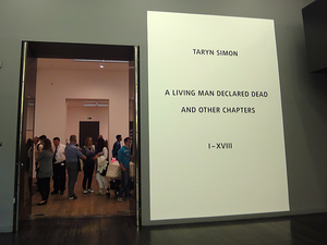
Tate Modern: Taryn Simon A Living Man Declared Dead and Other Chapters
 My goal is to pass beyond the guy at the podium and start my trip to England and beyond. 'What's the purpose of your trip?' the guy asks holding my passport. To see art, of course. Instead, I say 'visit family.' I want to slip in, look ordinary like my passport photo on its neutral background.
 Inside Britain, inside the Tate Modern, there's a big show of Joan Miro work, but today I look at a living artist, Taryn Simon. In A Living Man Declared Dead and Other Chapters, she shows a series of photo and text assemblages - each with about three parts. One is a grid of passport-like photos, next is text, and third, what the artist calls footnotes.
When the photo is stark enough, like these or a passport, The Identity could be anyone's. One of Simon's subjects is the double for Saddam Hussein's son. Another is a rabbit.
I had to testify, once, before a grand jury. I was handed a page of color photos with the open-ended question: could I identify anyone on this page? My husband's picture was there and I didn't recognize him until the district attorney pointed him out. The photo was such a bad likeness, and I was surprised to see him on this sheet. He'd sold a truck to a friend, one of the suspected pot growers. I guessed another photo might be a female friend. She was so plain and typical looking in this photo that I wasn't sure. 'Poor pothead, doesn't even know her own people,' I am sure the grand jury was thinking. I was thinking how hard a person is to identify with one photograph.
To truly identify an individual ask to see a facebook page, a library record, my home, or my journal. But, that is not the purpose of passport control. Their job is security; so scan my body for weapons, make sure I am committed to working for a more just and liberal - sorry, liberated - society, and plan to harm no one. What is the artist's job?
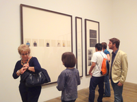
 Simon's show - in three big galleries - consists of many large, nicely framed grids of photos - images of small heads on a 'non-place' background. They are similar in style, but different from a passport photo in that they are full of one of the necessary ingredients of abstract art: namelessness. Abstract art removed the human so that the image could be universal. The humanlessness of passport photos is why governments want retinal scans and DNA. The artist either doesn't know how humanless these photos are, or we're to feel like they are the universal human.
I read the wall's worth of information about how the grid is like a family tree showing relationships - descendants below antecedents - and then read the details at each piece about some weird political situation that involves these identities - like Saddam's son's double. Or, people whose relatives have declared them dead so they can steal their land.
Conceptually, the project is interesting. However, the artist has not made the best choices for conveying the information to her audience. Sure anything goes in postmodern art. But, we're at the Tate Modern here, and there needs to be some discrimination. Why? Because a lot of people will see the work, so it should be effective for the audience - the viewers that will see it. Otherwise, it's just granddad boring us with pictures he took of his hotel rooms on his bus tour of Germany.
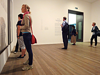
 Look at the people in this exhibition. They're myopically reading the walls. Or standing in the center talking. One of our group suggests that Simon make it easier to read the narrative, and give us the time and space to read it - publish a book. Good idea, but her current audience is, right now, wandering through the Tate Modern. And, it's a big crowd, a less-than-mainstream crowd: people willing and able to look at contemporary visual art. Give us the visuals.
Could the relationships have been identified graphically? Tiny text at the side giving the name wasn't helpful enough. The 'footnotes' sections are not in giant frames. They're small, filled with documents, some interesting character snapshots, and the meat. Isn't it annoying to read footnotes that are more interesting than the main body of the work?
Yes, there was that big explanation at the beginning of how the project worked, rows related to the rows above and below. We all felt compelled to read that, but then the artist mixed it up, and it wasn't the key to work out the relationships after all. Obviously relationship is important. If there were no pictures the person was dead. I read it. I could go and do more reading, youTube searching, and see if I could understand it.
I did watch the video, and the artist is a lovely young woman. She spent four years traveling around the world, and the relationships she says she's trying to present are those of chance, blood or other elements of fate. Nowhere in the show, but on the video she says, people are each just one in a long string of births and deaths all with stories attached, and they keep coming (hopefully).
But we didn't get to meet these people on a trip around the world, and we need more to feel or understand it - otherwise this is just a big waste of time, effort and money, which is why people hate contemporary art. It feels like the artist is doing this for herself. Self expression: well then, you can just keep it to yourself.
 The weak photographs - even as wallpaper - draw our attention because of the size of the frames. We look, we try to understand, but unfortunately there isn't enough visually in front of us to engage us further and enable us to really see something more than just the narrative summary she gives us.
Maybe this show is an example of how bad journalism is nowadays. The only story that I could read to the end was about Sadaam's son's double, and yeah, I know, it's coming out as a movie soon. It's a tabloid kind of story, and the lives of ordinary people usually aren't, even if they are doing very interesting things. Like trying to make art about the relationships of unique ordinary people.