 When I walk into a Gothic cathedral I get what its creators hoped would be the original Shock & Awe Treatment. The containing of this much space exudes power. Commands some awe. Worship in the right souls, if not mine.
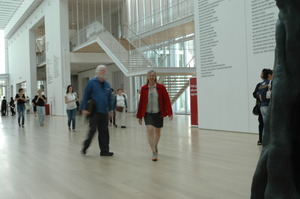
The modern wing of the Art Institute of Chicago is one more building in the new shockwave of awe inspiring architecture. Its volume made this institution the second largest art museum in the U.S when it was completed in 2009. It was time we became another couple of its art tourists.
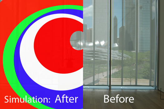
We walked up a long ramp from the botanic gardens in Grant Park and landed on the top floor in front of the rooftop restaurant. Saw the new installation out on the high patio which was the subject of an editorial in the Chicago Tribune on Sunday - and noticed that it did indeed block the view to downtown, but gives a peephole to Millennium Park. After stepping off the vinyl of the patio floor, we descended by escalator between walls of glass to the first floor and into the expanse of the new glass and white metal building designed by Renzo Piano.
 Then a fortunate thing happened. Right in front of us was the show I wanted to see: contemporary photographs by Uta Barth. Knowing now how much there is to see in this enormous wing, without even contemplating the impressive Impressionist stuff that's in the old building, I would have been challenged to give full attention to this small, two-room show.
Instead it became my grand entry to this amazing space - a beautifully sparse beginning worthy of a Coen Brothers movie. Barth's work is ethereal. Drawings without any lines.
They are photographs, and are essentially scenes. Interiors. An out of focus table, soft shadows of a glass and pitcher, or maybe a bottle. Not the things just the shadows of them. A fragment of an arm and a hand's shadow.
The first objects I saw were a pair of 'couch sized' photos. No frames just the image mounted on a sturdy piece of white Plexiglas - the hardware, the physical disappeared. The next images included little tangible stuff, little more than a simple orb of a ceiling lamp. The top edge of a couch made its way into the frame, too, but the real focus was shadow and light.
What do you think of these? I asked the guard, who let me know she'd had some time to look at them. 'I don't get it at all,' she said. They're just shadows. Maybe, somebody's house. Somebody who likes the way they decorated their house.'
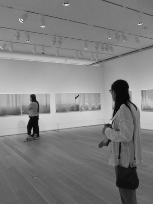 'I think you had it right the first time,' I said. 'If somebody cared about the decoration, we'd see more of it. I think it's about how beautiful the shadows are. How they fall on the wall and what shapes and tones they make.'
I've seen light do this kind of thing before - been inside small spaces where shadows piled up on each other - and I thank the artist for reminding me to look.
Then I asked my friend what she thought. She felt like the artist was ripping off the craftsperson who designed the lamp.
We went into the next room and the photos were even more abstract - just curving lines of white on a undulating gray field. The gray was a textured curtain draping in waves like the folds of cloth on the characters in classical painting. The flow of white was a cast of bright light repeating this curling wave is a graphical way. Just a natural incident of light, somewhat manipulated by the artist playing with the curtain.
Yes, she manipulated the curtain, she admitted on the curatorial card. And this is not normal for Barth, the info continued. She didn't modify the photographs, just helped the light fall in a beautiful way. So it's not naturally occurring shadows and light. Artist modified light, instead. I've heard many artists talk about their work with more evasion than a politician. This is the epitome of transparency.
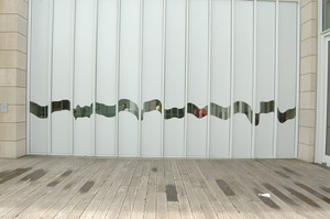 There was another little space behind the wall where the photographs hung, and catalogs of Bath's work were laid out on a white table with a single chair available to readers. The big windows to the courtyard were covered with white vinyl film with a little wave cut out so you could see outside. 'Wouldn't it have been nice with a curtain? my friend said. 'Instead of plastic.'
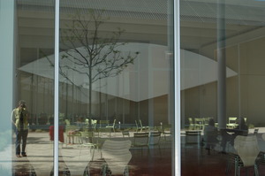 It would have been so easy to ignore the subtle images Barth photographs, but seeing them made it easier for us to sense the enormous gulf between cloth and vinyl. We'd been given a little boost of Day Vision.
And then, we went back through the show, past the guard and she stopped me, 'Those shadows on the lamp are really interesting.. I've been wondering .., 'why'd that light land on the wall like that?' We talked about shadows a little more and went out into the courtyard where light was bouncing around like a crazy person.
I neglected to ask the guard what she considers her life work, but my friend, a lawyer by education, makes mosaics, and I write about the experience of looking at contemporary art.