How Jesus would want to show his paintings
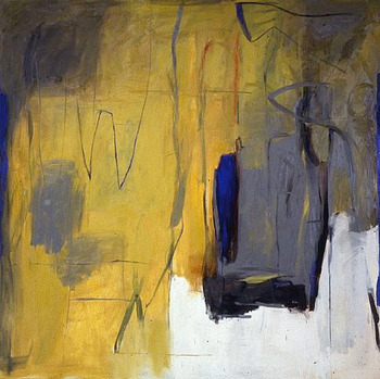 Dale Chisman was a Colorado artist. He graduated from the University of Colorado in Boulder, went to New York for a while, and over his 40-year career became known to a lot of people who care about art in Denver, Boulder and the rest of the state. He died recently and there have been a few opportunities to see his work. But the current retrospective at RedLine is how I'd want to see my work if I was a painter like Dale Chisman.
The show is curated by Jennifer Doran Robischon, and more of the retrospective is at Robischon Gallery. Both parts are up from January 13 until February 27, 2011.
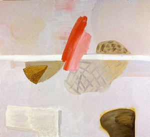
You can see (from the small photos I've copied here) that his paintings are colorful and are not Realism. You can't tell how very large and powerful they are. One of the people speaking about his work, Michael Paglia, an art critic for Westword, said he thought 'Butch' as in Macho, was a way to describe how direct and strong these images are. My companion dismissed that expression; he said they had a Presence - nothing so mean as butch - something like stage presence, dramatic and larger than life. Set to demand attention. If you owned one, I can imagine it would take over a living room, and force you to enjoy looking at it, and to find something new and interesting in it, often.
 But seeing the assemblage - about 50 big, bold paintings - in the space at Redline where the ceiling seems a mile away, I thought, if I was God I'd be happy that this is how they did my church.
The main gallery at Redline is white and new feeling, like the Denver Art Museum's new addition, but with more regular, perdendicular walls. The arrangement of the collection in this space is ultra-pleasantly professional - like a big museum show - only there's no educational crap, nor any audio headsets interfering with the viewing.
The paintings are strong on the white walls, and 'authentic,' as Paglia also said, as we listened to a panel discussion about the work. A debate began between panelists about how materialistic, ethereal or meditative the work was -- something I associate with Abstract Expressionism -- which another speaker, Simon Zalkind mentioned, but was put down because every painting seems to have some kind of a grounded object. You'd never think of a Rothko as having an object in it. So, no, these aren't ether-like like Rothko. But the work, nonetheless could be described as abstract and expressive. And you can look at it for a while - like a flickering candle - and be content.
The grounded objects do say something about how we see things, even though they aren't specific objects. Some elements seem to be in focus, and sometimes they're not. There are no laws followed about focus like 'depth of field' so we don't interpret these paintings like a photograph. To blur or focus is all human decision. Focused can be right next to unfocused, maybe on top of it. The paintings seem to me like a revolving memory with one piece getting the thinker's attention while others are fading. Adam Lerner, the director of the Museum of Contemporary Art and the panel moderator, said it another way. He said things seem to be appearing and disappearing. Animation, memory, focus - unsettled contemporary issues about seeing.
And back to their strength -- either masculine, dramatic or just bigness -- they assert rebellion. Works were divided directly in half. A real design no-no. A mauve pink that never gets much play elsewhere is all over the newer works. Colors combine in ways you've never seen in Better Homes and Gardens.
Everyone said Chisman was a sweet guy, maybe prone to write late night criticisms to the art editor, and although he was painting in the '80s until his death in 2008 in an abstract tradition that had it's heyday in the 50s, rebellion crept in, and questions of seeing are present.
Someone on the panel said his family was Christian Scientist. It was unlikely that he was practicing that religion - he was a smoker and a drinker I learned in this short discussion. I'd never met him, but a friend of mine verified this, and had also been raised Christian Scientist. Optimism. That what the work has, he said, a distinct sign of a Christian Scientist.
Optimistic, not mean. They do demand attention, but enjoyment is what they demand.
 Dale Chisman was a Colorado artist. He graduated from the University of Colorado in Boulder, went to New York for a while, and over his 40-year career became known to a lot of people who care about art in Denver, Boulder and the rest of the state. He died recently and there have been a few opportunities to see his work. But the current retrospective at RedLine is how I'd want to see my work if I was a painter like Dale Chisman.
 The show is curated by Jennifer Doran Robischon, and more of the retrospective is at Robischon Gallery. Both parts are up from January 13 until February 27, 2011.
You can see (from the small photos I've copied here) that his paintings are colorful and are not Realism. You can't tell how very large and powerful they are. One of the people speaking about his work, Michael Paglia, an art critic for Westword, said he thought 'Butch' as in Macho, was a way to describe how direct and strong these images are. My companion dismissed that expression; he said they had a Presence - nothing so mean as butch - something like stage presence, dramatic and larger than life. Set to demand attention. If you owned one, I can imagine it would take over a living room, and force you to enjoy looking at it, and to find something new and interesting in it, often.
 But seeing the assemblage - about 50 big, bold paintings - in the space at Redline where the ceiling seems a mile away, I thought, if I was God I'd be happy that this is how they did my church.
 The main gallery at Redline is white and new feeling, like the Denver Art Museum's new addition, but with more regular, perdendicular walls. The arrangement of the collection in this space is ultra-pleasantly professional - like a big museum show - only there's no educational crap, nor any audio headsets interfering with the viewing.
The paintings are strong on the white walls, and 'authentic,' as Paglia also said, as we listened to a panel discussion about the work. A debate began between panelists about how materialistic, ethereal or meditative the work was -- something I associate with Abstract Expressionism -- which another speaker, Simon Zalkind mentioned, but was put down because every painting seems to have some kind of a grounded object. You'd never think of a Rothko as having an object in it. So, no, these aren't ether-like like Rothko. But the work, nonetheless could be described as abstract and expressive. And you can look at it for a while - like a flickering candle - and be content.
The grounded objects do say something about how we see things, even though they aren't specific objects. Some elements seem to be in focus, and sometimes they're not. There are no laws followed about focus like 'depth of field' so we don't interpret these paintings like a photograph. To blur or focus is all human decision. Focused can be right next to unfocused, maybe on top of it. The paintings seem to me like a revolving memory with one piece getting the thinker's attention while others are fading. Adam Lerner, the director of the Museum of Contemporary Art and the panel moderator, said it another way. He said things seem to be appearing and disappearing. Animation, memory, focus - unsettled contemporary issues about seeing.
And back to their strength -- either masculine, dramatic or just bigness -- they assert rebellion. Works were divided directly in half. A real design no-no. A mauve pink that never gets much play elsewhere is all over the newer works. Colors combine in ways you've never seen in Better Homes and Gardens.
Everyone said Chisman was a sweet guy, maybe prone to write late night criticisms to the art editor, and although he was painting in the '80s until his death in 2008 in an abstract tradition that had it's heyday in the 50s, rebellion crept in, and questions of seeing are present.
Someone on the panel said his family was Christian Scientist. It was unlikely that he was practicing that religion - he was a smoker and a drinker I learned in this short discussion. I'd never met him, but a friend of mine verified this, and had also been raised Christian Scientist. Optimism. That what the work has, he said, a distinct sign of a Christian Scientist.
Optimistic, not mean. They do demand attention, but enjoyment is what they demand.
