Dissolve - or Try to Stand Out
June 24, 2010
 SANTA FE, NEW MEXICO - A panel of a half dozen people sat brightly lit behind microphones and glasses of water, in a dark auditorium in Santa Fe. Two women took turns speaking, composing their sentences slowly, deeply considered each word before it was uttered. The two women spoke as if they had been struggling - and not always successfully -- to save lives in peril amid atrocious conditions. We were late, having driving straight from Colorado to make this mid-day lecture, and fumbled for seats in the dark. We'd missed any introductions, but watched the images being projected on the wall and figured out who these women were and with what they were struggling. They were trying to make art.
We would see their work in the 8th annual SITE Santa Fe Biennial, which was opening the next day. The show is called The Dissolve, and is all animation. These artists, Kara Walker and Mary Reid Kelley were helping to open the show by discussing their work with the curators in front of the public. And their seriousness gave us the hint that The Dissolve wasn't going to be Saturday morning cartoons or Pixar.
Guess what it would be? Flickering images in dark room...yes. Citizen Cane, Gone with the Wind, Birth of a Nation ... colder, colder. Fantasia, spin art, Monty Python ... getting warmer. At least 40 moving images including short, tricky, comedy films from the dawn of motion pictures to the animated shadow play Walker recently finished about racial violence. TV in a contemporary art museum demands more attention that sitting at home with a bowl of popcorn. Just watching a movie with other people you get a sense of what makes other people laugh or sob that you don't get by slipping in a DVD.
Watching TV in an art space is usually annoying because you can't get away from the flickering or the sound, and there are still and quiet things you want to see. The Dissolve eliminated these issues by eliminating the still.
The curators explained how hard they worked to give each piece it's own space. David Adjaye, an architect who designed the Contemporary Art Museum in Denver, designed the show, and everyone was raving about it.
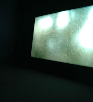
So, the next day, we step into SITE from the blazing New Mexico sun. Airplanes fly across a 6-foot screen. The airplanes pretend to be drawn on a flipbook. Hiraki Sawa has recreated my first attempt at making animation - drawing a picture in the corner of a book and purring through the pages - but somehow I realize while looking at this video that he faked it. The pages don't actually diminish to the end and I'm not sure that the airplanes were actually drawn. This disappoints me. But the B&W moving image is a warm, a little nostalgic, welcome. Peeking around it, the big warehouse space is glowing, spaces delineated with red, deep blue and a veiled green.
Around the first corner, a toy car scene lays on a table. Video from four cameras is spliced together as if an automatic TV director is calling out 'close-up,' 'two-shot,' 'wide-shot,' etc. This show plays above the toy scene. The subject is a traffic jam, we can tell by the sound of honking cars, and the title of the piece "Traffic #1, Our Second Date," makes it personal. A tiny, toy couple watch the jam from park benches. The expression on their faces (close-up) is fascinatingly always the same.
Seeing film and the filmed at the same time is not often possible, but we know it exists. Jennifer and Kevin McCoy gives viewers the immediate experience of it.
On a long wall where several videos play, in one, a man dressed like a butler in tails is drawing a picture on a large sketchpad. He draws a bottle of wine and a glass and then plucks the real think off the board. This film was made by the Edison Company to promote the idea of moving pictures sometime between 1894 and 1918. I can imagine the people who made this little old film, and I don't hear them talking like angst-driven artists. Its inclusion in this show puts the struggle to make relevant video art in 2010 in historical, real-world perspective. And the genius of art is much harder to accomplish than a gag.
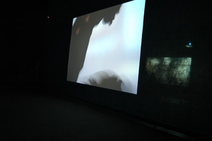 Opposite the cleaver promo film is Kara Walker's saga. Paper puppets move across the screen in silhouette. The racist (especially if you think it's racist to denegrate the Redneck) storyline taken from the real history of criminals and assholes that Walker has researched is not clearly spelled out in the film, but the imagery is beautiful.
The sound is subtle - old-timey jazz - although the paper characters are in a horror show of rape and denigration. The strings or sticks that manipulate the puppets are obvious and the film takes advantage of four dimensions. Time, and the usual three.
So we know the figures are puppets, we know which characters are the Rednecks and which are the Negros by the profiles of their stereotypical hair and lips. The silhouette and flatness of the puppets - the total style of Walker's work - are easy to relate to historical art from Africa and emphasize black and white. In every second of video there is something being communicated and nothing gets in its way.
Walker's work, Six Miles from Springfield on the Franklin Road, is 25 minutes, an epic among so many pieces, and I can't take it all in in one sitting. There's so much more to be seen..
Jacco Olivier makes a finger painting, and another one, and another and links them together as a moving film with a similar plot to Avitar. Lush in color, it is less than 2 minutes long. We might not have criticized the story line if Avitar had been so short. (Same can be said for a few of the more narrative (not really fully narrative) videos in the rest of this show.)
Another flawless (given the time we have to devote to it) is About to Forget. In it, Berni Searle lays a cut-out silhouette of three clumps of people in a tray that is filled with water - we can hear it being poured - and red dye from the paper dissolves into the water in front of our eyes on three different large screens. You know you've seen this paper before. The texture is something you understand but can't quite explain. The bottom edge of the paper is crinkled and the figures seem to be standing in a natural landscape that's loosing all its color. One of the silhouette forms doesn't quite stand up. It flops onto the bulk of the paper. It confirms that the image was made with paper. The red dye leaves the paper and swirls around in the water until the whole scene starts over again. Better than a lava lamp.
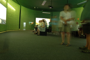 I followed the show in the suggested viewing order and at this point, entering a circular room made of gauzy drapery, I started to feel overloaded. The room is busy, quiet except for layers of whispered content coming from speakers directly above the viewing area.
I got sucked into watching an older woman in costumes of obvious types: nun, sailor, cowboy. These change every few minutes. She appeared to be singing something in German, a traditional folk song, maybe. The costumes related to drawings layered behind her, but I can't understand the German. There are a lot of people in this gauzy-green room, and four other videos demanding attention. I placed myself under the speaker and got lured into the singsong of the German woman. I try to make sense of the other works. Random images. Random narrative. Sure, there's some cool drawing, cool photo and digital images, but not much clarity.
DAY TWO
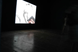
Afraid I was going to miss some bits of genius due to overload-blackout, I left the green gauzy room and walked out of SITE. Three gems would have been missed if I hadn't come back for a second try days later. One was the work of William Kentridge. Watch someone draw, erase and redraw an image as it tells a story. Nothing like watching paint dry; it's beautiful; vivid gray smudges remind you of what was drawn like your dreaming it.
Two, Cindy Sherman's short piece where her image is a paper doll in a package. A true breath of clarity. Herself, as the paper doll gets put in different costumes, then packaged away..
And more clarity appears in a series called Black Stuntman by Robert Pruitt. Black Stunt Man is an ordinary black guy, facing ordinary troubles with a costume - pencil drawn, of course. A narrator describes him in a matter-of-fact-way, accompanied by hip-hop music, with insightful references to the way it is..
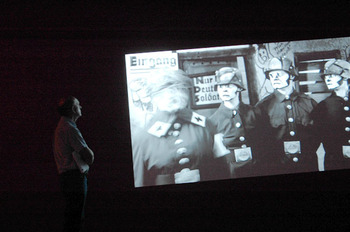
Black Stuntman is one of several videos in a big square room. There is a big screen showing the work of one of the angst-filled women, Mary Reid Kelley. The script of the piece is a pun-filled poem called 'You Make Me Iliad'. The iambic pentameter poem is read for a camera by the serious voice of its creator. The look of this speaker and the other characters who represent German WWI soldiers reminded me of an old B&W cartoon of Mickey Mouse. They are dramatically made-up to look like original Mickey.
This connection is suggested to me because there were several other films from the early cartoon era playing in the same room with the Iliad. On five airplane-sized screens, I could watch one of these and keep an eye on the Iliad sing-song on, as a visually dramatic, large screen backdrop. The poem is nonsense. Cleaver figures of speech, alone, do not make exceptional poetry. The whole piece offers a little more Mickey than Mouse.
By this time, I have several hours into this show and still am missing something. Months later I visit Santa Fe again, and see the dance piece by Bill T. Jones and OpenEnded Group, called After Ghostcatching, a Virtual Dance for Stereoscopic Display. Lines of colored light describe the moving body. It's beautiful.
If the success of an art exhibition is how many hours I can be entertained by it, then this 8th Biennial is one of SITE's most successful.
Terry Talty writes about the experience of being human and looking at contemporary art.
June 24, 2010
 SANTA FE, NEW MEXICO - A panel of a half dozen people sat brightly lit behind microphones and glasses of water, in a dark auditorium in Santa Fe. Two women took turns speaking, composing their sentences slowly, deeply considered each word before it was uttered. The two women spoke as if they had been struggling - and not always successfully -- to save lives in peril amid atrocious conditions. We were late, having driving straight from Colorado to make this mid-day lecture, and fumbled for seats in the dark. We'd missed any introductions, but watched the images being projected on the wall and figured out who these women were and with what they were struggling. They were trying to make art.
We would see their work in the 8th annual SITE Santa Fe Biennial, which was opening the next day. The show is called The Dissolve, and is all animation. These artists, Kara Walker and Mary Reid Kelley were helping to open the show by discussing their work with the curators in front of the public. And their seriousness gave us the hint that The Dissolve wasn't going to be Saturday morning cartoons or Pixar.
Guess what it would be? Flickering images in dark room...yes. Citizen Cane, Gone with the Wind, Birth of a Nation ... colder, colder. Fantasia, spin art, Monty Python ... getting warmer. At least 40 moving images including short, tricky, comedy films from the dawn of motion pictures to the animated shadow play Walker recently finished about racial violence. TV in a contemporary art museum demands more attention that sitting at home with a bowl of popcorn. Just watching a movie with other people you get a sense of what makes other people laugh or sob that you don't get by slipping in a DVD.
Watching TV in an art space is usually annoying because you can't get away from the flickering or the sound, and there are still and quiet things you want to see. The Dissolve eliminated these issues by eliminating the still.
The curators explained how hard they worked to give each piece it's own space. David Adjaye, an architect who designed the Contemporary Art Museum in Denver, designed the show, and everyone was raving about it.
So, the next day, we step into SITE from the blazing New Mexico sun. Airplanes fly across a 6-foot screen. The airplanes pretend to be drawn on a flipbook. Hiraki Sawa has recreated my first attempt at making animation - drawing a picture in the corner of a book and purring through the pages - but somehow I realize while looking at this video that he faked it. The pages don't actually diminish to the end and I'm not sure that the airplanes were actually drawn. This disappoints me. But the B&W moving image is a warm, a little nostalgic, welcome. Peeking around it, the big warehouse space is glowing, spaces delineated with red, deep blue and a veiled green.
Around the first corner, a toy car scene lays on a table. Video from four cameras is spliced together as if an automatic TV director is calling out 'close-up,' 'two-shot,' 'wide-shot,' etc. This show plays above the toy scene. The subject is a traffic jam, we can tell by the sound of honking cars, and the title of the piece "Traffic #1, Our Second Date," makes it personal. A tiny, toy couple watch the jam from park benches. The expression on their faces (close-up) is fascinatingly always the same.
Seeing film and the filmed at the same time is not often possible, but we know it exists. Jennifer and Kevin McCoy gives viewers the immediate experience of it.
On a long wall where several videos play, in one, a man dressed like a butler in tails is drawing a picture on a large sketchpad. He draws a bottle of wine and a glass and then plucks the real think off the board. This film was made by the Edison Company to promote the idea of moving pictures sometime between 1894 and 1918. I can imagine the people who made this little old film, and I don't hear them talking like angst-driven artists. Its inclusion in this show puts the struggle to make relevant video art in 2010 in historical, real-world perspective. And the genius of art is much harder to accomplish than a gag.
 Opposite the cleaver promo film is Kara Walker's saga. Paper puppets move across the screen in silhouette. The racist (especially if you think it's racist to denegrate the Redneck) storyline taken from the real history of criminals and assholes that Walker has researched is not clearly spelled out in the film, but the imagery is beautiful.
 The sound is subtle - old-timey jazz - although the paper characters are in a horror show of rape and denigration. The strings or sticks that manipulate the puppets are obvious and the film takes advantage of four dimensions. Time, and the usual three.
So we know the figures are puppets, we know which characters are the Rednecks and which are the Negros by the profiles of their stereotypical hair and lips. The silhouette and flatness of the puppets - the total style of Walker's work - are easy to relate to historical art from Africa and emphasize black and white. In every second of video there is something being communicated and nothing gets in its way.
Walker's work, Six Miles from Springfield on the Franklin Road, is 25 minutes, an epic among so many pieces, and I can't take it all in in one sitting. There's so much more to be seen..
Jacco Olivier makes a finger painting, and another one, and another and links them together as a moving film with a similar plot to Avitar. Lush in color, it is less than 2 minutes long. We might not have criticized the story line if Avitar had been so short. (Same can be said for a few of the more narrative (not really fully narrative) videos in the rest of this show.)

Another flawless (given the time we have to devote to it) is About to Forget. In it, Berni Searle lays a cut-out silhouette of three clumps of people in a tray that is filled with water - we can hear it being poured - and red dye from the paper dissolves into the water in front of our eyes on three different large screens. You know you've seen this paper before. The texture is something you understand but can't quite explain. The bottom edge of the paper is crinkled and the figures seem to be standing in a natural landscape that's loosing all its color. One of the silhouette forms doesn't quite stand up. It flops onto the bulk of the paper. It confirms that the image was made with paper. The red dye leaves the paper and swirls around in the water until the whole scene starts over again. Better than a lava lamp.
 I followed the show in the suggested viewing order and at this point, entering a circular room made of gauzy drapery, I started to feel overloaded. The room is busy, quiet except for layers of whispered content coming from speakers directly above the viewing area.
 I got sucked into watching an older woman in costumes of obvious types: nun, sailor, cowboy. These change every few minutes. She appeared to be singing something in German, a traditional folk song, maybe. The costumes related to drawings layered behind her, but I can't understand the German. There are a lot of people in this gauzy-green room, and four other videos demanding attention. I placed myself under the speaker and got lured into the singsong of the German woman. I try to make sense of the other works. Random images. Random narrative. Sure, there's some cool drawing, cool photo and digital images, but not much clarity.
DAY TWO
Afraid I was going to miss some bits of genius due to overload-blackout, I left the green gauzy room and walked out of SITE. Three gems would have been missed if I hadn't come back for a second try days later. One was the work of William Kentridge. Watch someone draw, erase and redraw an image as it tells a story. Nothing like watching paint dry; it's beautiful; vivid gray smudges remind you of what was drawn like your dreaming it.
Two, Cindy Sherman's short piece where her image is a paper doll in a package. A true breath of clarity. Herself, as the paper doll gets put in different costumes, then packaged away..
And more clarity appears in a series called Black Stuntman by Robert Pruitt. Black Stunt Man is an ordinary black guy, facing ordinary troubles with a costume - pencil drawn, of course. A narrator describes him in a matter-of-fact-way, accompanied by hip-hop music, with insightful references to the way it is..
Black Stuntman is one of several videos in a big square room. There is a big screen showing the work of one of the angst-filled women, Mary Reid Kelley. The script of the piece is a pun-filled poem called 'You Make Me Iliad'. The iambic pentameter poem is read for a camera by the serious voice of its creator. The look of this speaker and the other characters who represent German WWI soldiers reminded me of an old B&W cartoon of Mickey Mouse. They are dramatically made-up to look like original Mickey.
This connection is suggested to me because there were several other films from the early cartoon era playing in the same room with the Iliad. On five airplane-sized screens, I could watch one of these and keep an eye on the Iliad sing-song on, as a visually dramatic, large screen backdrop. The poem is nonsense. Cleaver figures of speech, alone, do not make exceptional poetry. The whole piece offers a little more Mickey than Mouse.
By this time, I have several hours into this show and still am missing something. Months later I visit Santa Fe again, and see the dance piece by Bill T. Jones and OpenEnded Group, called After Ghostcatching, a Virtual Dance for Stereoscopic Display. Lines of colored light describe the moving body. It's beautiful.
If the success of an art exhibition is how many hours I can be entertained by it, then this 8th Biennial is one of SITE's most successful.
Terry Talty writes about the experience of being human and looking at contemporary art.
